Share this page


Widget functionality
After you add and configure dashboard widgets, use the widget functionality to find the data you need and perform in-depth analysis.
View more details
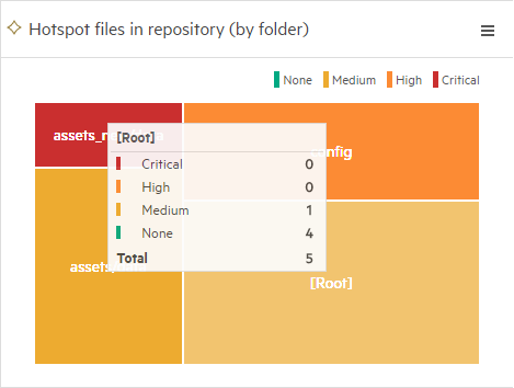
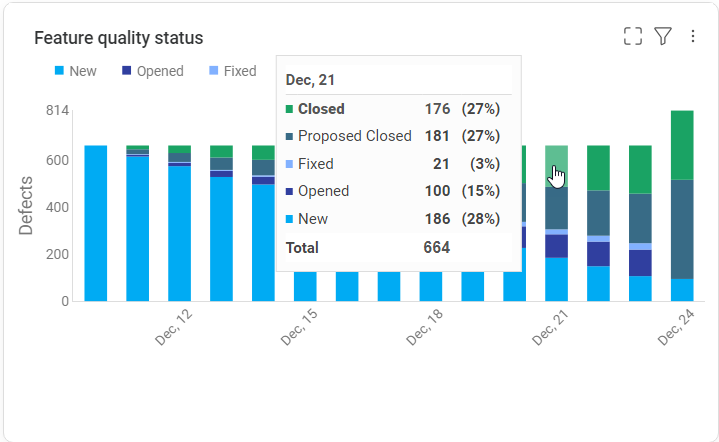
For the different sections in a graph, hover over the section to see a tooltip with details.
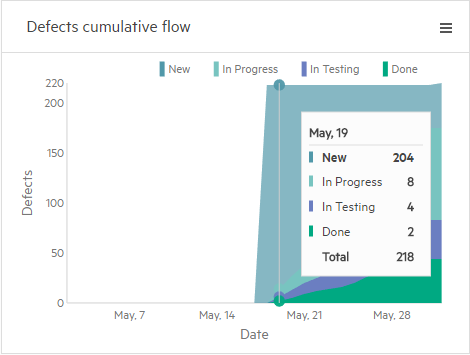
For trend-based graphs, drag the mouse along the trend line to see a period-by-period detail:

Drill down and compare data
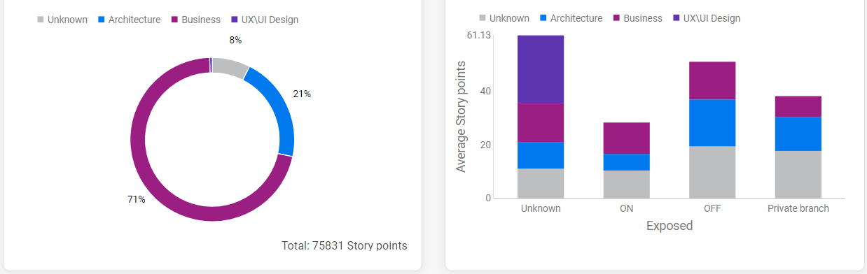
You can drill down to referenced items, such as features or application modules, by clicking a graph segment or table data.
View the items in a grid or in a smart list. You can sort, filter, group by, and search for items. In grid view, you can add or remove columns.
Trend-based graphs
Available in versions: 24.1 and later
In trend-based graphs, you can drill down to items from a specific time period and compare data from different periods. For example, this can help you understand scope changes over the course of a release: you can compare the number of planned features at the beginning and the end of a release, and view which planned features were added, removed, or unchanged during that period.
Note: Drilldown in trend-based graphs is supported for the following graph types:
- Bar graph – when the Show trend of changes option is not selected
- Stacked bar graph
For details on different graph types, see Display settings - graph display type.
In trend-based graphs, you can drill down to items from a specific time period and compare data from different periods. For example, this can help you understand scope changes over the course of a release: you can compare the number of planned features at the beginning and the end of a release, and view which planned features were added, removed, or unchanged during that period.
When comparing data from different periods, you can:
- View items that were added, removed, or unchanged.
- Compare the Stack by field values (in a stacked bar graph).
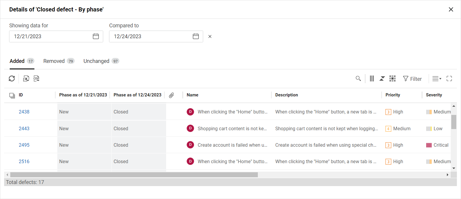
To compare data from different periods:
- Click a segment in the graph to view the referenced items for a given date. The date you select is used as the basis for comparison.
- Click Compare and select a later date for comparison. The date you select must be within the date range defined for the widget. For details on defining the date range for a widget, see Date range.
-
Above the grid, select a tab to view the relevant items: Added, Removed, or Unchanged.
Tab Details Added Items that did not meet the filter criteria at the first date, and did meet the filter criteria at the second date.
These items were added to the selected graph segment during the period of comparison.Removed Items that met the filter criteria at the first date, and did not meet the filter criteria at the second date.
These items were removed from the selected graph segment during the period of comparison.Unchanged Items that met the filter criteria on both dates.
These items remained in the selected graph segment throughout the period of comparison.In a stacked bar graph, the Stack by field is shown with two columns. These columns display the field values for the two dates selected for comparison. All other fields display the current values.
Note:
- Items that met the filter criteria and were later deleted are shown at the bottom of the grid.
- When you export data from the grid to an Excel or CSV file, only the data in the displayed tab is exported. If specific items are selected, only the selected items are exported.
Hide/show data
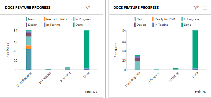
Click a value in the widget's legend to show or hide data in the widget.
Example: In the widget on the left, all of the data is shown. In the widget on the right, New and Ready for R&D are hidden, to hide features that are not yet ready to be documented. The values are deselected in the legend, and the related data is not shown in the graph.
Sort by clusters
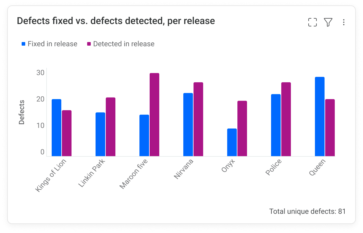
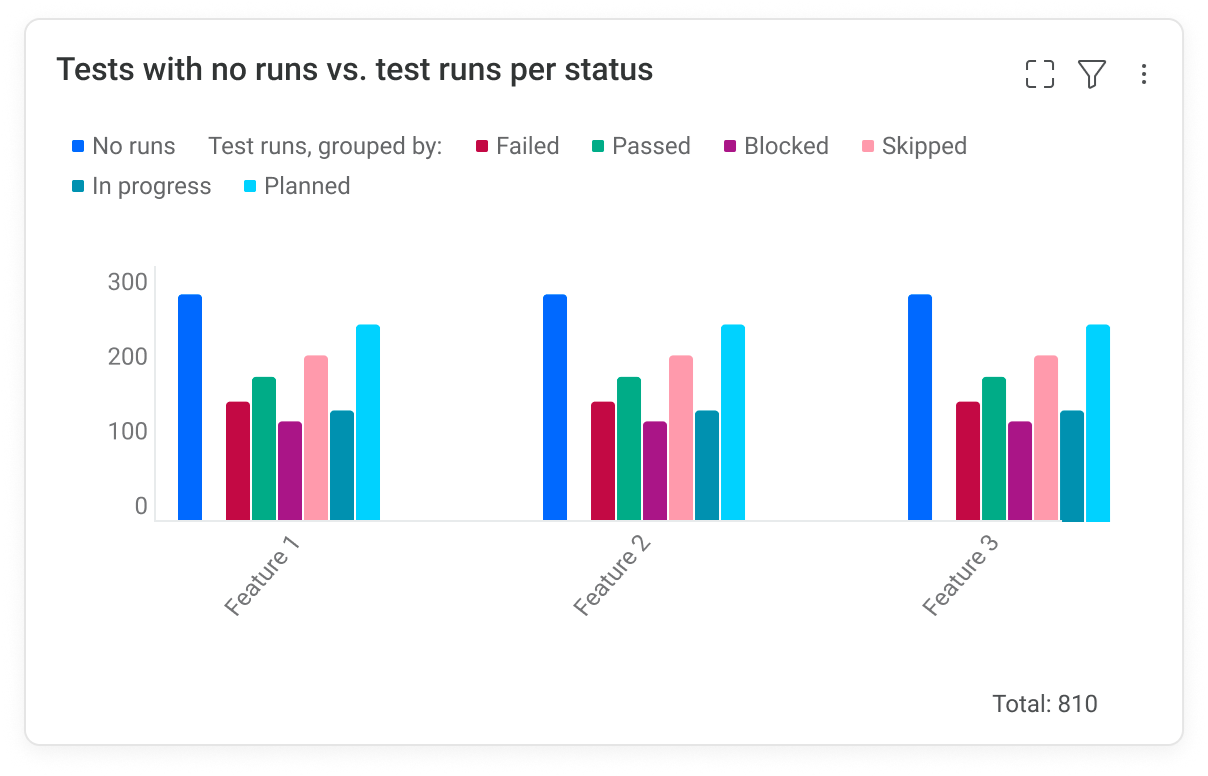
You can use the grouped bar chart display  to show multiple bar clusters within a single widget, to compare results for different items for multiple fields.
For this metric, you define two metrics, choose one or more data sets.
When using a single data set, you can show different attributes of the same entity as different bars within the widget. For example, you can show:
-
A feature's estimated story points vs. the actual story points per team or sprint.
-
New defects vs. fixed defects per sprint.
When using multiple data sets, you can show the entity information based on multiple fields.
Single data set example
The following example shows two metrics with a single data set. One metric shows the number of defects fixed in the release, while the other shows the total number of defects detected in the release.
Multiple data set example
The following example shows two metrics with multiple data sets. One metric shows the number of tests that did not run, and the other shows tests with all other statuses. The Group by filter is used to distinguish between the statuses.
Compare fields across widgets
Available in versions: 24.1 and later
In widgets that use the same Stack by or Group by fields, segments and columns that represent the same field values are given the same color across the different widgets in a dashboard. This makes analysis easier when examining different KPIs for the same items.
Insight cards
Insight cards are pop-up windows associated with dashboard widgets that are marked with the Insight  icon. Insight cards provide a summary view in the form of a graph, with a linkable list of items whose values were included in the widget.
For details, see Insight cards.
 See also: