Share this page


Merging types overview
This topic describes the three types of merging graphs: Overlay, Tile, and Correlate. For details, see the Merge Graphs dialog box.
Overlay
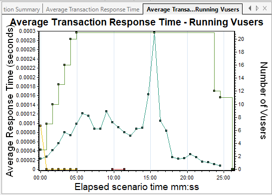
You can superimpose the contents of two graphs that share a common x- axis. The left y-axis on the merged graph shows the current graph's values. The right y-axis shows the values of the graph that was merged. There is no limit to the number of graphs that you can overlay. When you overlay two graphs, the y-axis for each graph is displayed separately to the right and left of the graph. When you overlay more than two graphs, a single y-axis is shown, scaling the different measurements accordingly.
In the following example, the Average Transaction Response Time and Running Vusers graphs are overlaid with one another.

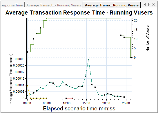
Tile
You can view contents of two graphs that share a common x-axis in a tiled layout, one above the other. In the following example, the Average Transaction Response Time and Running Vusers graphs are tiled one above the other.
Correlate
Use the Correlate option to plot the y-axis of two graphs against each other. The active graph's y-axis becomes the x-axis of the merged graph. The y-axis of the graph that was merged, becomes the merged graph's y-axis.
In the following example, the Average Transaction Response Time and Running Vusers graphs are correlated with one another. The x-axis displays the Elapsed scenario time and the y-axis shows the average response time.