The Web Resource graphs provide you with information about the performance of your web server. You use them to analyze the data collected during interaction with the web server.
Bytes Sent per Second graph
The Bytes Sent per Second graph shows the amount of data sent by DevWeb Vusers to the server during the load test scenario run. For details on DevWeb scripts, see DevWeb tests.
It is measured in bytes, and represents the amount of data that the Vusers sent to the server at any given second.
To view this graph, in the Session Explorer window click the Add New Graph button. Open the Web Resources > Bytes Sent per Second graph.
| Axis | Description |
|---|---|
| X-axis | Elapsed time since the start of the scenario run. |
| Y-axis | Data sent to the server, in bytes. |
Connections graph
Depending on the emulated browser type, each Vuser may open several simultaneous connections per web server. The Connections graph shows the number of open TCP/IP connections (y-axis) at each point in time of the load test scenario (x-axis). It indicates when additional connections are needed. For example, if the number of connections reaches a plateau, and the transaction response time sharply increases, then adding connections would likely cause a reduction in the transaction response time. This would be a dramatic improvement in performance.
| Axis | Description |
|---|---|
| X-axis | Elapsed time since the start of the run. |
| Y-axis | Open TCP/IP connections. |
Connections per Second graph
This graph shows the number of new TCP/IP connections opened and the number of connections that are shut down for each second of the load test scenario.
The number of new connections should be a small fraction of the number of hits per second. This is because new TCP/IP connections use significant amounts of server, router, and network resources. Ideally, many HTTP requests should use the same connection, instead of opening a new connection for each request.
| Axis | Description |
|---|---|
| X-axis | Elapsed time since the start of the run. |
| Y-axis | TCP/IP connections per second. |
Hits per Second graph
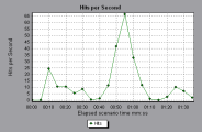
The Hits per Second graph shows the number of HTTP requests made by Vusers to the web server during each second of the load test scenario run. It helps to evaluate the amount of load Vusers generate, in terms of the number of hits. You can also compare this graph with the Average Transaction Response Time graph to see how the number of hits affect the transaction performance. For more information, see Average Transaction Response Time graph.
Note: You cannot change the granularity of the X-axis to a value that is less than the web granularity you defined in the General tab of the Options dialog box. For more information, see Options dialog box
| Axis | Description |
|---|---|
| X-axis | Elapsed time since the start of the run. |
| Y-axis | Number of hits on the server. |
In the following example, the most hits per second took place at 55 seconds into the scenario.
HTTP Responses per Second graph
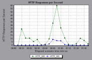
The HTTP Responses per Second graph shows the number of HTTP status codes returned from the web server during each second of the load test scenario run, grouped by status code. HTTP status codes indicate the status of the HTTP requests, for example, if the request was successful or the page was not found.
To locate scripts that generated error codes, you can group the results shown in this graph by script, using the Group By function. For more information, see Filter and sort graph data.
For a list of HTTP status codes often encountered in load tests, see HTTP status codes.
| Axis | Description |
|---|---|
| X‑axis | Elapsed time since the start of the run. |
| Y‑axis | Number of HTTP responses per second. |
In the following example, the greatest amount of 200 status codes, 60, was generated 55 seconds into the scenario run. The greatest amount of 302 codes, 8.5, was generated 55 seconds into the scenario run.
HTTP Status Code Summary graph
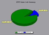
The HTTP Status Code Summary graph shows the number of HTTP status codes returned from the web server during the load test scenario run, grouped by status code. HTTP status codes indicate the status of HTTP requests, for example, if the request was successful, or the page was not found.
You can use this graph together with the HTTP Responses per Second graph to locate scripts that generated error codes. This graph is available in pie view only.
For a list of HTTP status codes often encountered in load tests, see HTTP status codes.
In the following example, the graph shows that only the HTTP status codes 200 and 302 were generated. Status code 200 was generated 1,100 times, and status code 302 was generated 125 times.
Pages Downloaded per Second graph
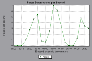
The Page Downloaded per Second graph shows the number of web pages downloaded from the server during each second of the load test scenario run.
Like the Throughput graph, the Pages Downloaded per Second graph represents the amount of data that the Vusers received from the server at any given second. However, the Throughput graph takes into account each resource and its size (for example, the size of each .gif file or the size of each web page). The Pages Downloaded per Second graph takes into account only the number of pages.
Note: To view the Pages Downloaded per Second graph, you must select Pages per second (HTML Mode only) from the runtime settings Preferences tab before running your scenario.
| Axis | Description |
|---|---|
| X-axis | Elapsed time since the start of the run. |
| Y-axis | Number of web pages downloaded from the server. |
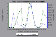
Example: In the following example, the greatest number of pages downloaded per second, about seven, occurred 50 seconds into the scenario run.
Example: In the following example, the Throughput graph is merged with the Pages Downloaded per Second graph. It is apparent from the graph that throughput is not completely proportional to the number of pages downloaded per second. For example, between 10 and 25 seconds into the scenario run, the number of pages downloaded per second increased, while the throughput decreased.
Requests per Server per Second graph
The Requests per Server per Second graph shows the number of HTTP requests made by DevWeb Vusers to each web server during each second of the load test scenario run. It helps to evaluate the amount of load in terms of the number of hits per host.
To view this graph, in the Session Explorer window click the Add New Graph button. Open the Web Resources > Requests per Server per Second graph.
| Axis | Description |
|---|---|
| X-axis | Elapsed time since the start of the scenario run. |
| Y-axis | Number of hits on the server. |
Retries per Second graph
The Retries per Second graph displays the number of attempted server connections during each second of the load test scenario run. A server connection is retried when:
-
the initial connection was unauthorized
-
proxy authentication is required
-
the initial connection was closed by the server
-
the initial connection to the server could not be made
-
when the server was initially unable to resolve the load generator's IP address
| Axis | Description |
|---|---|
| X-axis | Elapsed time since the start of the run. |
| Y-axis | Number of server retries per second. |
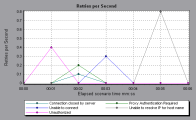
In the following example, the graph shows that during the first second of the scenario, the number of retries was 0.4, whereas in the fifth second of the scenario, the number of retries per second rose to 0.8.
Retries Summary graph
The Retries Summary graph shows the number of attempted server connections during the load test scenario run, grouped by the cause of the retry. You can use this graph together with the Retries per Second graph to determine when server retries were attempted.
This graph is available in pie view only.
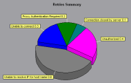
In the following example, the graph shows that the server's inability to resolve the load generator's IP address was the leading cause of server retries during the scenario run.
SSLs per Second graph
The SSLs per Second graph shows the number of new and reused SSL Connections opened in each second of the load test scenario. An SSL connection is opened by the browser after a TCP/IP connection has been opened to a secure server.
| Axis | Description |
|---|---|
| X-axis | Elapsed time since the start of the run. |
| Y-axis | Number of SSL Connections. |
Throughput and Throughput (MB) graphs
These graphs show the amount of throughput on the server during each second of the load test scenario run. Throughput is measured in bytes or megabytes and represents the amount of data that the Vusers received from the server at any given second. To view throughput in megabytes, use the Throughput (MB) graph. You can compare this graph with the Average Transaction Response Time graph to see how the throughput affects transaction performance.
Note: You cannot change the granularity of the X-axis to a value that is less than the web granularity you defined in the General tab of the Options dialog box.
| Axis | Description |
|---|---|
| X-axis | Elapsed time since the start of the scenario run. |
| Y-axis | Throughput of the server, in bytes or megabytes. |
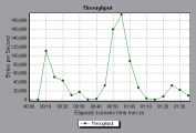
In the following example, the highest throughput is 193,242 bytes at 55 seconds into the scenario.
 See also:


