Share this page


Change the granularity of the data
You can make the graphs easier to read and analyze by changing the granularity (scale) of the x-axis. The maximum granularity is half of the graph's time range. To ensure readability and clarity, Analysis automatically adjusts the minimum granularity of graphs with ranges of 500 seconds or more.
In the following example, the Hits per Second graph is displayed using different granularities. The y-axis represents the number of hits per second within the granularity interval. For a granularity of 1, the y-axis shows the number of hits per second for each one second period of the load test scenario.
For a granularity of 5, the y-axis shows the number of hits per second for every five-second period of the scenario.
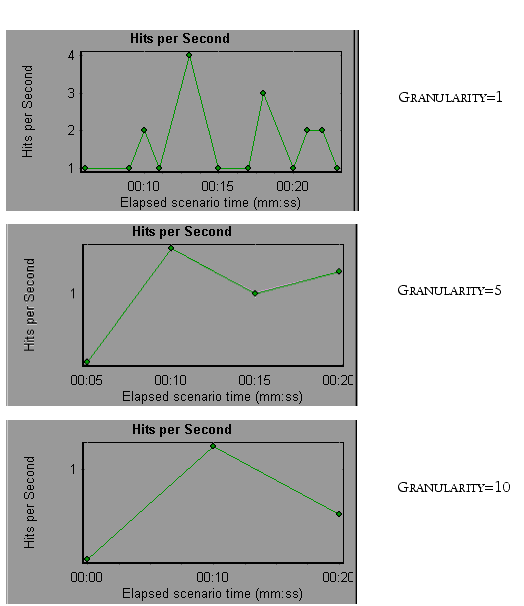
In the above graphs, the same load test scenario results are displayed in a granularity of 1, 5, and 10. The lower the granularity, the more detailed the results. For example, using a low granularity as in the upper graph, you see the intervals in which no hits occurred. It is useful to use a higher granularity to study the overall Vuser behavior throughout the scenario.
By viewing the same graph with a higher granularity, you can see that overall, there was an average of approximately 1 hit per second.