Share this page


ALM Octane insights
ALM Octane's widgets provide insight cards that help you analyze trends, identify bottlenecks, find correlations, detect anomalies, and better understand what you need to improve in your development cycle.
Insight cards
Insight cards are pop-up windows associated with Dashboard widgets that are marked with the Insight  icon.
icon.
Insight cards provide a summary view in the form of a graph, with a linkable list of items whose values were included in the widget.
Using the information from insight cards, you can:
- Track the feature highest cycle times to identify bottlenecks in the development process as well as wasted time. This helps you understand how to improve your cycle and plan future releases.
- Compare the development cycle time between releases and milestones to understand whether you are improving, and if not, then why.
- Determine the item time to market to assess the effectiveness of your development process.
- Analyze the trend of items' cycle time/resolution speed vs. quality to understand how they correlate with one another.
- Identify areas in your product with high quality risk to understand how to increase the efficiency of your testing strategy and mitigate the risk.
- Determine whether investment in automation improves key indicators, such as speed, cost, and efficiency.
You can create multiple widgets to check cycle time and trends for different releases or different item scopes.
To open an insight card:
-
Add a widget to your dashboard. Widgets with insights contain the Insight
icon in their description.For details on adding widgets to the dashboard, see Set up the dashboard.
-
Set the widget scope and add the widget to your Dashboard page.
For details, see Configure widget data settings.
-
Select the widget. The insight pane opens.
If you close the insight pane, you can reopen it by selecting the widget again.
-
Drill down by:
- Selecting a filter, for example, a release or phase.
- Clicking one of the linked items in the list.
- Hovering over the desired part of the graph to view additional information.
Note: Versions of ALM Octane preceding CP5 (12.55.8) did not collect tracking data. Therefore, if entities were created in earlier versions, their data may not appear in the graphs.
To export your top 100 insights:
- From the insight pane, click Show more...
- In the toolbar, click the Export to Excel button
 .
.

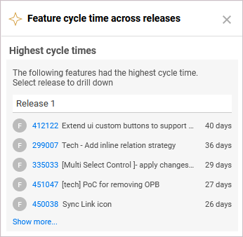
Highest cycle times per release insights
This insight card opens from the Feature cycle time across releases widget. It displays the top 100 features with the highest cycle time, per release.
To drill down to a specific release, select the necessary release from the drop-down menu.
To drill down to feature details, click the feature link. This can help you learn why the feature cycle time was excessive.
Highest cycle times per release by phase insights
This insight card opens from the Feature cycle time by phase across releases widget. It displays a list of features with the highest cycle time, per release and phase.
To drill down and check the cycle time for a specific phase in a release, select the release and the phase from the drop-down menu.
To drill down to feature details, click the feature link. This can help you learn why the feature cycle time was excessive.
Highest cycle times insights
This insight card opens from the Feature cycle time by phase widget. It displays a list of features with the highest cycle time.
To drill down and check the cycle time for a specific phase, select the phase from the drop-down menu.
To drill down to feature details, click the feature link. This can help you learn why the feature cycle time was excessive.
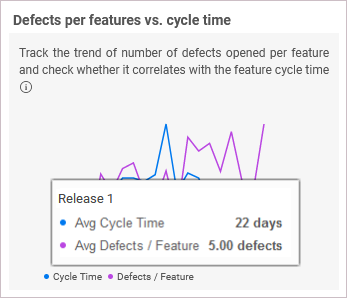
Defects per feature vs. cycle time insights
This insight card opens from the Feature cycle time across releases widget. It displays a trend of cycle time in comparison with a trend of the average number of defects per feature.
Using this comparison, you can determine the quality of features, as well as the correlation between speed and quality. For example, if you see an improved cycle time for features, but it also caused a decrease in the quality, you need to further check your processes. Make sure the decrease in quality is not correlated with the improved features cycle time.
To make your insights more relevant, you can create multiple widgets of the same type, filtering each one differently. For example, features with many story points or user stories, will naturally have longer cycle times. In this case, you can create one widget to show only features with 50 or less story points, and another one showing features with 51 or more story points. To do so, open the widget's Scope page and define an additional filter for story points. For details, see Configure widget data settings.
Highest resolution times insights
This insight card opens from the Defect resolution time widgets. It displays a list of defects with the highest resolution times.
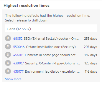
To drill down and check the resolution time for a specific phase, select the phase from the drop down menu.
To drill down to defect details, click a defect link. This can help you learn why the resolution time was excessive.
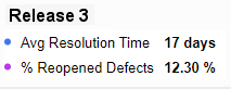
Resolution time vs. reopen rate insights
This insight card opens from the Defect resolution time across releases widget. It displays the ratio of average defect resolution time across releases vs. the trend of defects reopening. The reopen rate refers to defects that were moved from the Fixed to the Opened metaphase or from the Closed to the Opened metaphase.
Tip: You can see the number of reopens by in the Reopens field. If it is not displayed, use the Customize fields button  to add it.
The insight trend enables you to check whether the reopen rate correlates with the defect resolution time. For example:
- A reduction in defect resolution may not always be beneficial. For example, the quality of the fix may be compromised due to a high reopen rate.
- An increase in defect resolution time may not always indicate a problem. For example, if the reopening ratio has a decreasing trend, this can indicate that more time is being spent on providing higher quality fixes.
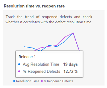
Hover over a point in the graph to see the value at a given point.
Automation ROI insights
To see insights about Automation ROI (Return on Investment), select the Automation ROI widget in the dashboard.
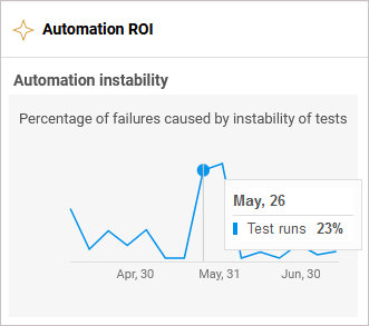
The Automation instability insight provides an indication of whether your automation is stable, and where it can be modified to improve the ROI. If the automation is unstable, it can dramatically lower the automation ROI.
Note: The insight shows the trends of oscillating and unstable tests in the selected pipelines and releases. It is not affected however, by the test automation or application module filters.
This insight describes a trend showing the failures identified as ‘unstable’, as a percentage of all runs in the selected area. The failures are caused by unstable tests. Hover over the graph to see the data for a specific point in time.
For more information about ROI tools, see Automation ROI.
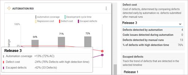
ROI metrics cards
Beneath the Automation instability graph, the insight pane displays additional informational cards that let you drill down further to information displayed in the graph.
-
Defect cost. The cost of defects, determined by comparing defects detected early by automation vs. defects submitted after manual runs. Defects detected by automation refer to defects reported from automated runs that ran in the selected time frame. Choose a release from the dropdown to show the information relevant to you.
This section shows a summary of:
- Defects detected by automation
- Test failures due to code issues. This value reflects code issues for which defects were not opened. Broken code issues for which defects are not submitted, may significantly affect your cycle time. ALM Octane is able to detect these issues and add them into the calculation of the defect cost. This field requires ALM Octane version 15.1.20 or higher.
- Defects detected by manual runs
- Defects with high detection time. (percentage)

- Development cycle time—feature CT. The speed of development as determined by feature cycle time. Select a release or sprint to show the information that interests you.
- Escaped defects. Escaped defects are defects that were not detected by your automation suite nor by your manual testing activities. Investing more in automation aims to decrease defects leaks and improve quality. By investing more in automation, you expect to improve the trend and lower the number of escaped defects. This field is only visible when comparing multiple releases—not sprints.
- Regression cost—Manual test executions. The number of manual test executions for the selected application module, release, or sprint. Choose a release or sprint from the dropdown to show the information that interests you.
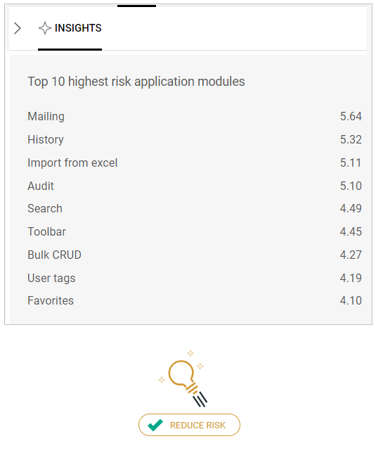
Quality risk insights
Within the Quality module, use the Risk page to locate areas where functionality is not sufficiently tested.
Quality risk insights
The quality risk insights present scores to help you identify the problematic areas. The risk scores are based on the selected timeline of the selected release.
The insights pane lists the child applications of the selected application module, with the top ten highest risk scores.
ALM Octane calculates a risk baseline from within all of your application module nodes. It then compares the problematic nodes with the baseline, and calculates a risk index.
Tip: To locate the actual node in the Application Modules tree, copy its title from the Top 10 list, and search for it in the left pane using the Search button  .
.
The quality risk score is calculated automatically every few hours based on the data shown in the middle pane, such as your application modules' code changes, risky commits, and test coverage. The higher is the score, the greater is the risk.
The pane only displays critical (red), high (orange), and medium (yellow) risk items. If only low (green) risk areas were found, they will not be shown.
The Reduce Risk button helps reduce the quality risk of the selected module by recommending a set of tests to run.
For details, see Quality risk analytics.
Available in: ValueEdge and from ALM Octane 16.0.400
This insight card is available from the recommended tests grid. The insights provide the main indicators that help you understand why the tests are recommended. For example, the analytics recommends and prioritizes tests that should provide a good coverage of a selected area and reduce its quality risk.
In the grid, select a test to view the following data in the insights pane:
-
The risk score for a selected application module the test covers
If the test covers more than one application module at risk, this will be reflected in an additional insight.
- The test's failure ratio
Analyze the above KPIs to decide whether to run the recommended test.
Note:
- Currently, tests recommendation is based on the risk score for an application module a test covers, the test's failure ratio, and its last execution time. Additional KPIs will be provided in the insights in future releases.
- When exporting the recommended tests to Excel, the test insights are provided in a separate Insights column.
For details, see Quality risk analytics.
Problematic work items root cause insights
Available in: ValueEdge
This insight card opens from the Problematic work items root cause analysis widget. The insights provide the AI analytics that helps identify what causes the items' problematic behavior, and understand which areas in your process need improvement.
Note: Ensure that your admin has enabled the AI analytics for your workspace. For details, see AI analytics management - admin tasks.
Overview
The AI insights for the Problematic work items root cause analysis widget are based on correlations or dependencies that imply any statistical relationship, whether causal or not. The correlations help measure how two or more fields are related to one another, and can indicate a predictive relationship between them.
Based on the AI insights, you can understand how prone certain environments, application modules, or other specified attributes are to having problematic work items.
The AI analytics considers the items defined as problematic, and displays correlations between them and the specified fields. This process helps determine the correlation score for each field.
The insights pane displays fields with the highest correlation score, and lets you drill down to the amounts of problematic work items for each field value.
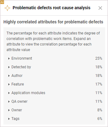
The insights provide the following data:
| Insights | Details |
|---|---|
| Correlation fields |
By default, the insights pane displays the top most highly correlated fields ordered according to their correlation level. The correlation score indicates the degree to which the field is related to problematic work items. If there is a significant correlation between the field values and problematic items, the field gets a higher score. Example: The widget is configured to track the escaped defects. If the correlation score for the Application module field is 30%, it means that there is 30% probability that the cause for defects' problematic behavior is connected with certain application modules. And if the correlation score for the QA owner field is 25%, it means that there is 25% probability that the defects’ problematic behavior is connected with specific members of the QA team. Expand a correlation field to drill down to specific field values. Note: The fields with the correlation score less than 5% are not displayed in the insights pane. |
| Values for correlation fields |
When expanded, each correlation field provides values most highly correlated with problematic work items. For example, the values for the Application module field will be specific application modules that are most highly correlated with problematic work items. Hover over a value bar to view the number and percentage of problematic work items for the given value. |
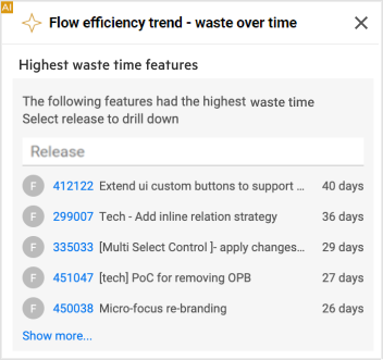
Flow efficiency trend - waste over time insights
Available in: ValueEdge
This insight card opens from the Flow efficiency trend - waste over time trend widget. For details, see Dashboard widgets: VSM category.
The AI insights display the top 5 work items with the highest waste time. Click Show more to drill down and identify up to 100 work items with the highest waste time in a scope. The items in the grid are ranked by waste time represented in the Waste column.
Click the release/milestone field to narrow down the list of work items, with the highest waste time, to a specific scope, as defined in the widget configuration.
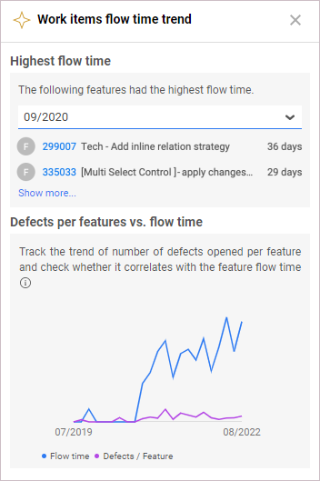
Work items flow time trend insights
Available in: ValueEdge
This insight card opens from the Work items flow time trend widget. For details, see Dashboard widgets: VSM category.
Highest flow time
The insight displays up to five work items, with the highest flow time, that were done in a specified period of time. Click Show more to drill down and identify up to 100 work items with the highest flow time in a scope. The items in the grid are ranked by flow time.
Defects per feature vs flow time
This insight provides a correlation between the changes in speed versus quality.
Based on the insight, you can conclude whether the decrease in the average flow time indicates progress, or signals a reduction in quality. For example, the development speed may be compromised by a high number of defects per feature.
 See also: