
Share this page


ALM Octane dashboard
The ALM Octane dashboard is the control center for analysis. It gives a visual, customizable display of the development progress and quality.
Add up to 30 widgets to a single dashboard view or the Overview tabs in the Backlog, Quality, and Pipelines modules to suit your product and team needs.
Set up the dashboard
In the ALM Octane banner, click the menu button  and select Dashboard. You can also select the Overview tab in the Backlog, Quality, or Pipelines modules.
To set up the dashboard:
- In the toolbar, click the + Add Widget button.
- In the Widget Gallery, select a category and a widget within the category, or click Add custom graph. Use the tabs in the Widget Editor to set up and configure your widget.
Tip: If you are not sure which widget to use, read the widget description to see which questions this widget helps answer.
-
Click Add to Dashboard. ALM Octane adds the widget at the bottom of the dashboard.
Repeat as necessary to suit your needs.
- In the toolbar, click the Dashboard layout
 button and select the necessary layout. Drag and drop widgets as needed.
 -
Available in ValueEdge and from ValueEdge and ALM Octane 16.1.100: Under the banner, apply the global context filter for the Release, Sprint, Milestone, and Date Range fields.
The global context filter affects all widgets with the Global filter setting, as well as new widgets added to the dashboard. You can override the global filter for individual widgets.
ALM Octane maintains the specific widgets and layout between sessions.
To clear the widgets on the dashboard and start again, click the Clear Dashboard  button.
Note: When the top section of a layout is empty, you will see a large gap enabling you to drag widgets easily into the section. If you plan to leave it empty, you might want to consider using a different layout.

Configure widget data settings
After you set up the Dashboard widgets, configure the data settings for each widget.
Available in ValueEdge and from ValueEdge and ALM Octane 16.1.100: You can define a release, sprint, and a milestone in a global context filter. By default, the global filter is applied to all new widgets added to the dashboard.
To configure the data settings:
-
In the widget's right corner, click the vertical ellipsis
 and select Configure.
Tip: If you want to duplicate a current widget configuration as a starting point, in the widget menu, select Duplicate. ALM Octane adds a widget named Copy of <Widget Name>.
-
On the General tab, select the graph type and update the name and description as needed. For non-Agile graphs, select Current Status or Status Over Time.
-
On the Scope tab, define the scope of the data to display, including:
-
Specify the workspaces from which ALM Octane should compile the graph's data. To use this field, the workspace must be associated with a shared space.
Enterprise edition: Using this field, you can define dashboard widgets that display cross-workspace information.
Select All my workspaces to compile data from all workspaces in which you are a member. The Workspace field is not supported for agile graphs, such as the Burn Up, Burn Down, Edit Release Forecast, and Cumulative Flow graphs.
-
Item type
The available items depend on the widget you are configuring. Expand the drop down for details.
 Common item types
Item type Description Tests Includes all subtypes of tests - manual tests, automated tests, Gherkin tests, BDD scenarios and test suites.
For details on the testing frameworks and test types available in ALM Octane, see Testing and Manual testing flow.
Work items Includes common work items, such as epics, defects, features, user stories, and quality stories.
Last test runs Includes only the last runs of all types of runs (manual run, automated run, suite run, Gherkin automated run). Popular use case: status and coverage analysis based on selected program, release, milestone, and environment.
For details on how Octane identifies runs as last runs see Plan and run manual and Gherkin tests
Backlog You can create a widget to show you the trends for Backlog items or Backlog's last test runs.
For details on the testing frameworks and test types available in ALM Octane, see Backlog management.
Test run history (manual) Includes all manual runs of manual tests, Gherkin tests and BDD scenarios. Tracking manual run progress is a popular use case.
Test run history (suites) Includes all suite runs. For details see Plan and run test suites. Pipeline run Includes all pipeline runs, which represent the builds of all root jobs that were defined as pipelines.
For details see Automated testing flow.
-
Use filter:
Option Details Local Apply the custom release, sprint, milestone, and date range settings for this individual widget. Global Use the settings defined in the dashboard's global context filter.
Note: The Global filter is set by default for all new widgets added to the dashboard.
- Release, Sprint, Milestone, Date Range
In widgets with the Global filter setting, the Release, Sprint, Milestone, and Date Range fields are predefined with values set in the dashboard's global context filter. To override the global filter settings, change the filter to Local, and set values for this individual widget.
-
-
For trend-based graphs (Status Over Time), specify a time period:
Time frame Details Without a release specified Select one of the following:
- The All <items> up to now option, the graph contains every item of the selected type from the beginning of your project until now.
-
Set period, the Last week, two weeks, or month.
-
Custom period, the Last xx days, weeks, or months, or Between specific dates.
With a release specified Select one of the following:
-
All <items> up to now, the graph includes the selected item type from the beginning of the specified release until now.
-
Release period, the graph includes the selected item type from the start date to the end date of the release.
-
Set period, the last week, two weeks or month.
-
Custom period, the Last xx days, weeks, or months, or Between specific dates.
-
All <items> up to end of release, the graph includes items created or updated from the beginning of the project until the end of the release.
-
All <items> from start of release up to now, the graph includes items created or updated from the start date of the release until now.
Note: When using trend-based graphs (for example, Burn Up or Burn Down charts), if one of the sprints includes a day with a clock change, the graph tooltips exclude the day, week, or month with the time change. The excluded period depends on the scope you set in the graph configuration.
For example, if a sprint includes the day the clock switches to Daylight Savings time, the tooltips exclude this day, week, or month.
-
On the Scope tab, define additional conditions for filtering dashboard widgets.
For example, if you only want to show defects that had a phase age of 60 days or more, add a Days in phase filter and specify Greater than 60.
If you select more than one workspace in the Workspaces field, filters display the fields common to all selected workspaces. Certain reference fields (such as Application Modules or Features) are not available for use in cross-workspace graph filters.
If you update the workspaces that are selected or open the same graph in a different workspace, ALM Octane clears the existing filters. For details, see Define filters.
-
On the Display tab:
-
Choose the desired graph format and its related options. For details, see Dashboard displays.
-
Select the field to display in the x-axis.
ValueEdge: In summary widgets, the x-axis can display date fields that are properties of items in a scope, for example Closed on, Creation time, or Started. You can also select user-defined fields of the Date and Time type. Aggregate the date values per days, weeks, or months.
Note: Date fields are not available for cross-fields.
-
For the y-axis, select whether you want to display the sum or count of the x-axis values.
Available in: ValueEdge and from ALM Octane 16.0.400
In summary widgets, the y-axis can also display an average of the x-axis values.
For a sum or average, you also need to select a unit, such as Estimated hours, Invested hours, and so forth.
-
Choose a Group by item by which to group the results.
-
-
Click Save.
ALM Octane updates the graph according to your selections.
Tip: To export data with full report data as if it were a graph, independent of the grid filtering settings, click the vertical ellipsis in the widget's upper-right corner, and click Export to Excel.
Dashboard displays
ALM Octane lets you choose from several display types, depending on the widget type.
In the General page, you select the graph type: Current Status, a summary graph, or Status Over Time, a trend-based graph. The dialog box will only display the available graphs for the selected graph type.
| Display type | Details | |
|---|---|---|

|
Bar graph (vertical) | For all graph types, a standard bar graph. |

|
Bar graph - per group | For trend-based graphs only, a vertical bar graph separated by group. |

|
Bar graph (horizontal) | For summary graphs only, a horizontal bar graph. |

|
Pie chart | For summary graphs only, a color coded pie chart with a legend above the chart describing the segments of the pie. |

|
Number chart |
Available in: ValueEdge and from ALM Octane 16.0.400 For summary graphs, the graph shows the widget value as an integer. You can choose to display a count, sum, or average of the item's values. To apply color coding to the number, enable the Use conditional color ranges option, and specify a range. For example, for a widget showing defects, you can designate red as the color for a count of 25 or more defects. |

|
Line graph |
For trend-based graphs, a standard color-coded line graph displays the field values. |

|
Area graph | For trend-based graphs, an area graph displays the data, indicating the ratios by color. |

|
Grid |
For summary graphs, each graph source, such as defects or tests, has default columns defined, which you can change as needed.
Enterprise edition: Grid widgets can display cross-workspace information. For example, you can show the defects with highest severity from all workspaces in a shared space. |

|
Accessible tabular format | For all graph types, this option displays the data in a table. |
In some of the widgets, you can select additional options:
| Option | Description |
|---|---|
| Double height | Displays a widget in an extra-long vertical format. By default, grids are displayed as double-height. |
| Include empty columns |
For Summary type graphs, this option includes data from features or application modules with no associated or assigned items. In summary widgets based on date fields, this option adds columns for dates that have no data to display. For example, you can configure the widget to display Closed on date for defects. In this case, empty columns with no defects closed on that date will be displayed, in addition to the columns with data. |
| Show trend of changes |
For trend-based graphs, this option counts all status changes in a given time frame—not just the final state of each entity. For example, if you want to see how many defects were opened and closed in each day, giving you a picture of the overall trend. You can use the Defect daily injection days/weeks graph to see how many defects were opened and closed by your team, over a two-week period. Note: When aggregating by weeks, the number for each date on the graph represents how many records were at the end of the week that started on the start date. |
Use dashboard widgets for analysis
After you add and configure widgets, use them to perform in-depth analysis:
| Usability | Details |
|---|---|
| View more details |
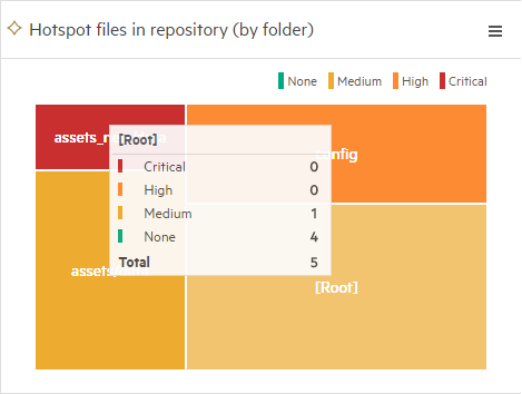
For the different sections in a graph, hover over the section to see a tooltip with details.
|
| Summary widgets: drill down to referenced items |
You can drill down to the referenced items, such as features or application modules, by clicking a graph section or table data. View items in a grid or in a smart list. You can sort, filter, group by, and search for items. In a grid view, you can add or remove columns. Note: For trend-based graphs, drill down to the referenced items is not available. |
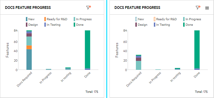
| Hide/Show data |
Click an item in the widget's legend to show or hide data in the widget. Example: In the widget on the left, we clicked New and Ready for R&D to hide features that are not yet ready to be documented. On the right, the items are hidden, and you can see that the widget items are not selected.
|
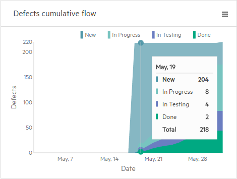
| Read values along the timeline |
For trend-based graphs, drag the mouse along the trend line to see a period-by-period detail:
|
Save and share dashboards
You can save a dashboard as a favorite. This allows you to maintain several dashboards, and lets you share them with other members of your workspace.
You can also create public links to dashboards that you can share outside ALM Octane. For details, see Favorites.
Export widget data and graphs
You can export the summary widget data to an .xlsx file, and the graph image to a .png file. The export options are not available for non-summary widgets.
To export the widget data and graph:
- In the graph's upper-right corner, click the vertical ellipsis .
- Select one of the following:
| Export type | Description |
|---|---|
| Export to Excel |
The widget data is downloaded to your computer as an .xlsx file. The file contains two sheets:
Note: For tabular widgets, the Summary sheet contains only the tabular data. |
| Export Image |
The widget graph is downloaded to your computer as a .png file. Note: The Export Image option is only available for summary widgets with graphs. |
Export dashboards to HTML
Available in: ValueEdge and from ValueEdge and ALM Octane 16.1.100
You can export a dashboard display as an independent .html file. This helps you get a static version of the dashboard, and use it as a baseline or for audit purposes.
You can open the exported .html file in any browser without signing in to ValueEdge and ALM Octane.
To export a dashboard to HTML:
-
Go to a dashboard display and click Export Dashboard to HTML
 .
. -
In the Export as HTML dialog box, enter the dashboard description.
The description is optional. It can include text and an image.
Tip:
- When exporting a dashboard favorite, click Update Favorite
 to keep the current description for future exports to HTML.
 - By default, the .html file includes a timestamp and a favorite name. To exclude these, clear the Show export date and time or Show favorite name checkboxes.
- When exporting a dashboard favorite, click Update Favorite
-
Click Export.
The .html file is saved to your default Downloads folder. The widgets and their tooltips reflect the static data as per the time of saving.
Note: In grid widgets, you can scroll through less items than in the live dashboard. Click an item ID to open the item in ValueEdge and ALM Octane. You will need to log in to ValueEdge and ALM Octane.
 See also:


