The board view
The board view provides a visual, interactive display of work items and their current status.
Overview
The board view provides a visual, interactive display of items. The board view is divided into swimlanes, where each lane represents a different phase for the selected entity. Under each swimlane header, the relevant items are displayed as cards.
The board view is available for epics, features, backlog items, tasks, and requirements (Children tab). It supports drag and drop in Workflow, allowing you to adjust the status of your items as required.
For items that support the board view, click Board View  in the top pane drop-down for view types.
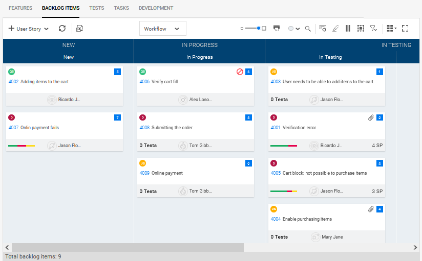
The example below shows a Story Board with backlog items in the New, In Progress, and In Testing phases.
Board view types
The common board views that can help you in your planning and backlog management are the Planning Board, Story Board, and Task Board.
| Type | Access | Description |
|---|---|---|
| Planning Board | Backlog module > Features > Board View  |
Use this view to help you plan your sprints and releases. For details, see The Planning Board. |
| Story Board | Team Backlog module > Story Board |
Use this view to see work items according to their context, such as a specific release, sprint, and team. The Story board view shows the Team Backlog > Backlog Items tab in board view, showing the status of user stories, quality stories, and defects. For details, see The Story Board. |
| Task Board | Team Backlog module > Task Board | Use this view to see the current status of your tasks: user stories, quality stories, and defects. The Task Board shows the Team Backlog > Tasks page in board view. For details, see Work on your stories. |
Work in the board view
The following table describes actions you can perform in the board view:
| Action | Details |
|---|---|
Slider  |
Change the card size. |
Print cards  |
Open the cards in a preview and print them. The filter you apply to the view also applies to the printing. For example, in Backlog items, if you only want to print the defects, select Defects as the Item type. |
Background color drop-down  |
Select a color for the board's background. This color only applies to the online view, not to the printout. |
| Cards customization |
Customize the card's view to include specific fields, both system and user-defined fields. The fields can be represented on cards as:
Depending on the board, the predefined fields are different and may include: rank, blocked status, attachments, test coverage, owner, or other fields. You can change the predefined fields to include other fields that are available for the given item type. In the toolbar, click Cards customization Tip: Hover over a card's field icon, specific value, or bar to view or drill down to an item details. Note:
|
Add colors according to rules  |
Users can add color preferences based on filter attributes. To learn more, see Assign colors. |
|
Filters |
Set a filter in the right pane. |
| Drag and drop for phase | Change a card's phase, for example from In Progress to In Testing. |
| Drag and drop for rank | Change a card's rank within its phase. The rank shows in the top right corner of the card, in a blue square. |
| Add items | In the toolbar, click the drop-down arrow next to the + and select the type of item to add. |
The Planning Board
For features, the board view is referred to as the Planning Board since it helps you plan the content of a release or several releases. It is typically used before a release, but you can also use it during the release to verify and adjust planning.
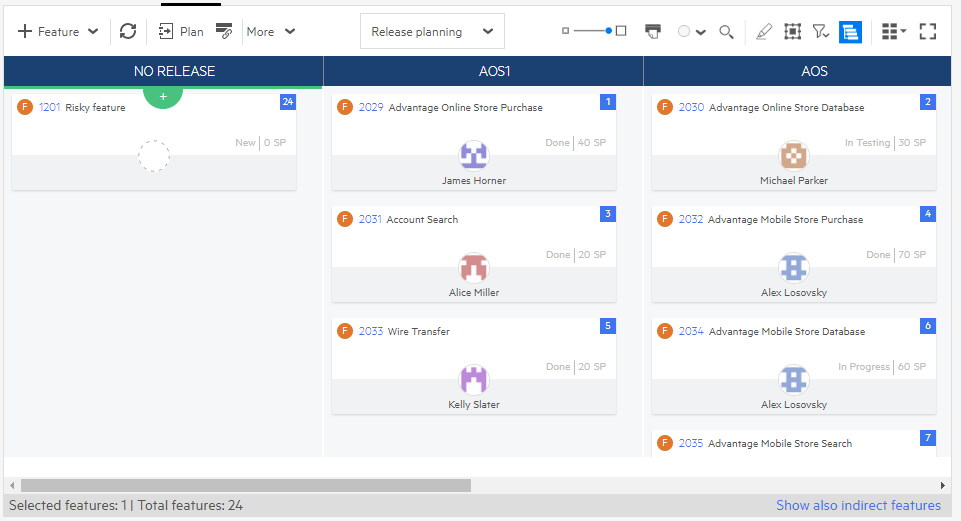
The Planning Board displays features according to their release or sprint, depending on the selection you made in the context filter on the top toolbar: Release planning or Sprint planning.
To access the Planning Board,
select the Backlog module > Features, and then click the Board View  button.
Select either Release Planning, or Sprint Planning from the view options. Drag and drop the features to the desired phase's swimlane.
Use the Planning Board
The following table describes how you can use the planning board.
| Action | Steps | ||||
|---|---|---|---|---|---|
| Move features |
You can distribute features between releases, sprints, and teams to balance the workload. To move features:
|
||||
| Add features to a release or sprint |
Select Release Planning or Sprint Planning from the view options, and then:
|
||||
| Remove features from a release or sprint |
To remove features from a release or a sprint, drag the items to the No Release or No Sprint column, depending on your view type. The Target Sprint will be cleared automatically. To display the No Sprint column, select either the Show all or No Sprint options in the sprint context filter. |
||||
| View dependencies between features and identify problematic dependencies | For details, see Planning Board feature dependencies. |
Planning Board feature dependencies
Dependencies between features are reflected in the Planning board. Features in a dependency relationship have a Dependencies exist icon on their card along with the number of dependencies the feature has.

To see the dependencies on the board, click the Dependencies exist  icon.
icon.
The following example shows the dependency relationships for feature 1015. Upstream and downstream dependencies are labeled accordingly.
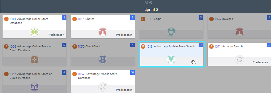
Problematic dependencies are when the predecessor activity does not finish before its successor activity. For details on dependencies, see Create dependencies. In case of problematic dependencies, the Problematic dependencies exist  icon is displayed.
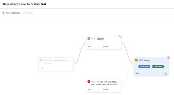
The dependencies map provides a comprehensive view of a feature's dependencies. While the Planning board is limited to the context of features and a specific sprint or release and displays only direct dependencies, the map displays all dependencies, regardless of the item type, sprint or release.
To open it, click the Dependencies exist  icon to display the dependencies on the Planning board, and then click the dependencies map
  icon.
icon.
Map legend
 Dependencies exist |
Click to switch the focus to different items to see their dependencies. |

|
Collapse a dependency branch. |

|
The item has problematic dependencies. |
| Faded edge | The branch of this dependency is not in focus. |
| Red edge | The upstream dependency is problematic. |
You can also add dependencies through the map. Select the item to which you want to add an upstream dependency, and then click the Add Dependency toolbar button.
Note: When you add a dependency to an item in the map, it does not immediately display potential issues. Click the refresh button to see problematic dependencies. This may take a few seconds.
The Story Board
The Story Board is a board view that displays your team's backlog items using either Kanban or Scrum methodologies. The board displays work items in the selected context: release, sprint, and team.
To access the Story Board, in the main menu, select Team Backlog > Story Board.
You can toggle the Story Board display modes by using the Workflow/Metaphase drop-down:
| Mode | Description |
|---|---|
| Workflow |
Select Workflow to view your board lanes by phases. The board view divides into the additional phases you have set to reflect your team's workflow. |
| Metaphase |
From the drop-down, select the Metaphase option to view your board lanes in an aggregated view. Metaphases are provided by default, cannot be modified, and are the same for quality stories, user stories, and defects. The categories are "New", "In Progress", "In Testing", and "Done". All phases for quality stories, user stories, and defects will belong to one of the metaphases. |
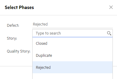
Note: If you filter out certain item types from the story board, phases that belong only to the excluded types are removed from the board. For example, if you filter out defects, the Rejected phase is hidden.
Customize the Story Board
When working in the Story Board, you can customize:
| Area | Details |
|---|---|
| The board view | You can include more columns for phases, merge phases for different item types, rename, or hide a specific column. |
| The cards view | You can change fields that are displayed on cards, and apply card color preferences. For details, see Work in the board view. |
You can also set the Work in Progress (WIP) limit and the card time limit. For details, see Story Board workflow rules.
Prerequisites
To customize the Story Board, you need the following:
- To be a team member of the selected team.
- To have the General System Actions > Customize Story Board By Member permissions. For details, see Roles and permissions.
To customize the Story Board, select a single team in the context filter.
The following table describes different actions and steps needed to customize your view:
| Action | Steps |
|---|---|
| Display phase lanes or metaphase lanes |
In the center, click the Workflow button. To display metaphase lanes, select Metaphase from the drop down. |
| Rename a column | Click the column name to enter into the edit mode. Rename the column and click outside the column name to save. |
| Merge columns |
If several columns represent the same phase for different item types, you can merge them into a single column. To merge columns:
|
| Split a column |
If you want to create separate swimlanes for different item types that share the same phase, you can split a column. To split a column:
|
| Hide a column |
Right-click the column that you want to hide, and then click Hide. To restore the column, in the toolbar, click the Choose Columns |
Add team phases to the Story Board
As a team member, you can add additional phases to your team's Story Board without modifying the general workflow.
Team phases are aimed for a specific team. They are available for all the team members and are not visible for other teams.
Note:
- Ensure that in the context filter, you have selected the team you are a member of, and the Workflow display mode.
- Adding team phases is supported in the Story Board, not in the Task or Planning Boards.
When creating a team phase, consider the following:
| Points | Details |
|---|---|
| View type | Team phases are displayed only in the board view, and are not represented in the grid view. |
| Phase - team phase relationships |
The following relationships between phases and team phases exist:
|
| Moving items between phases |
If a team phase includes a certain item type, you can not move its cards to a phase aimed for a different item type. For example, if a team phase includes defects, you can not move a defect from this phase to a phase designed for quality stories. |
To add a team phase:
- Right-click in the header area of an existing phase, either original or a team phase.
- Select Add team phase before or Add team phase after and provide the name for a new team phase.
The team phase is added to your team Story Board as a new swimlane.
Story Board workflow rules
When you work with the Story Board, you can specify rules to structure your workflow, including:
| A work-in-progress (WIP) limit |
A per-team limit for the number of items allowed (WIP) in each metaphase and phase. Each team can have different limits for each metaphase and phase. |
| Card time limit |
A per phase limit on the cycle time for an item in each phase. The cycle time is the time spent working on an item. This is the time it takes from when work begins on an item to when it is completed. ALM Octane measures the cycle time as the number of days in which the item is in the In Progress or In Testing phases. |
To set the Story Board rules:
-
At the top of the Team Backlog module, select a release and team from the drop-down lists.
-
The headers of the story board columns display the WIP for each phase, which is the number of items currently in that phase. Hover over the number in the header.
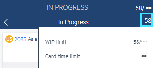
Note: The WIP represents the total number of items in the phase for the currently selected Release and Team. The WIP ignores other filters so you will always be able to tell if you are within or have exceeded the WIP limit.
-
In the displayed tooltip, click the infinity symbol in the relevant field and enter a new limit.
-
If the team violates one of the limits, ALM Octane displays an alert:
For WIP limits ALM Octane displays an alert icon in the phase column header:

For card time limits -
The Board View header displays an alert
-
The individual Board View card displays an alert with a clock icon. Hover over an icon to see details on the limit violation:
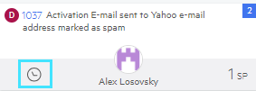
Hover over the alert to see the details.
-
-
For card time limits, track completion using the Control Chart widget in the Dashboard:
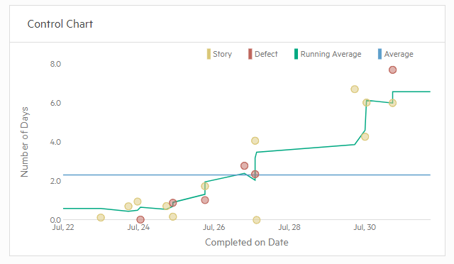
Note: This widget is per release and sprint, not per team.
 See also:


 button, and select Team.

 button, and select the column.


