Share this page


Customize portlet colors
Most of the portlet types include the option to specify particular colors for a portlet. Unlike the default color map that selects and changes the colors seemingly at random, the colors you specify are always used when the portlet is displayed.
To specify color mappings for a portlet requires configuration of the portlet data source and portlet definition.
Define color maps in the portlet data source
To specify the color map of a portlet, you need to add (or modify) columns in the portlet data source. For details of adding columns in a portlet data source, see Complete the Data Source tab.
In general, color mappings:
-
Should correspond to the column used in the Order By clause
-
Can be indicated for one or more of the Order By values
-
Color can be specified by:
-
Name (such as LemonChiffon)
-
Hexadecimal code (for example, #FFFACD)
Names or codes are case-insensitive.
-
Color Names provides a comprehensive list of color names and some recommendations about their use.
Tip: Specific colors can also be specified based on portlet field labels; however, these settings are instance-wide. This can be especially helpful for making colors consistent for field labels such as High, Medium, or Low.
Color map example
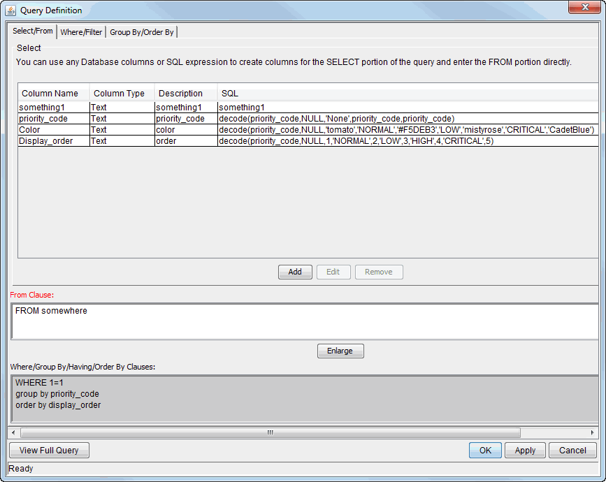
Figure 3-16. Color map in the portlet data source shows examples of these settings in the Select section of the Select/From tab of the Query Definition window (see Manage portlet data sources for details about this window).
-
The values for priority_code column include the priorities associated with a request (of the type being displayed in this portlet):
-
Normal
-
Low
-
High
-
Critical
-
None
-
-
The Display_order column ranks the values of the priority codes
-
The Order By clause specifies the use of the Display_order column
-
The Color column specifies the relationship of the colors to the display order as follows:
-
Wheat (by hexadecimal code) for Normal
-
MistyRose for Low
-
The default color for High (which means the color is subject to change)
-
CadetBlue for Critical
-
Tomato for None
-
Tip: The colors shown in this example, as well as the choice of portlet are probably unrealistic. You probably want to select colors that are meaningful to your organization and more practical than those selected for this example.
Figure 3-16. Color map in the portlet data source

Specify the color map in the portlet definition
Once a portlet data source includes a color map, you can specify its use in a color specification–enabled portlet.
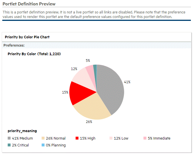
Figure 3-17. Default color map shows a preview of a pie chart that uses the default color map.
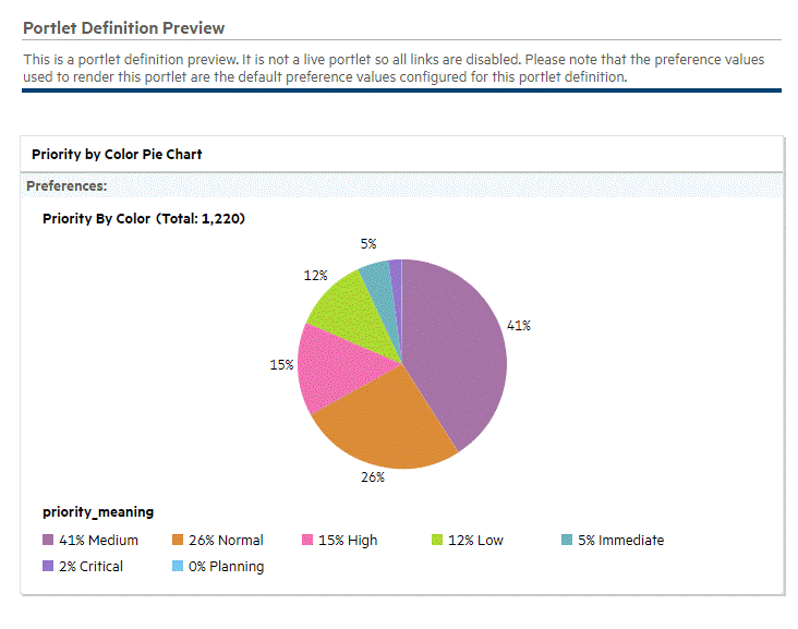
As shown in Figure 3-19. Selected color mappings, specifying a color map can help establish consistency of the portlet coloration and, potentially, its interpretation.
Figure 3-17. Default color map
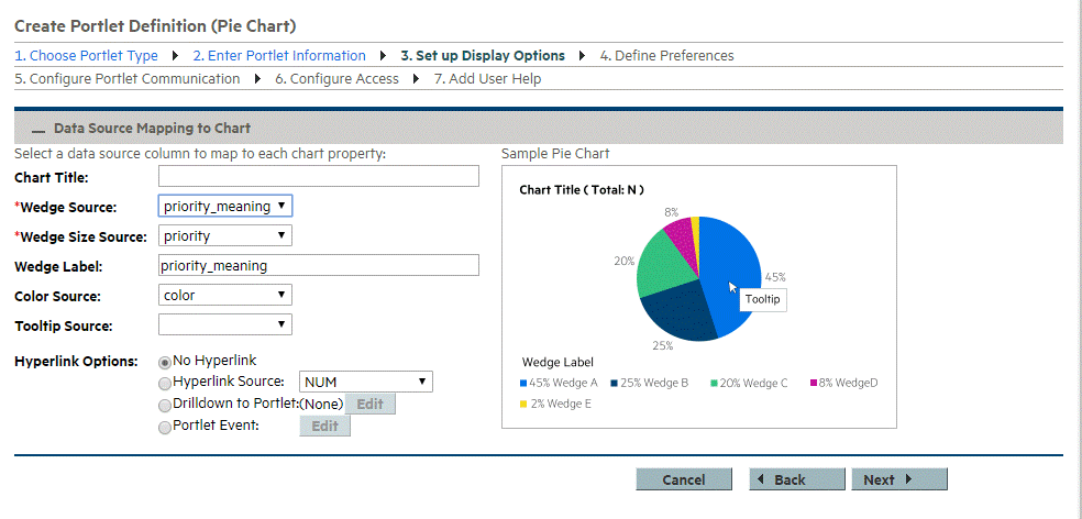
To specify use of a color map available in a portlet's data source, select the color map's column for the Color Source as shown in Figure 3-18. Set up Display Options with color specification.
Figure 3-18. Set up Display Options with color specification
The resulting preview is shown in Figure 3-19. Selected color mappings.
Figure 3-19. Selected color mappings