Share this page


Cost Benefit Tab
The Cost Benefit tab in the Scenario Comparison page provides a graph illustrating the cost/benefit analysis for each scenario. See Figure 5-5. Scenario Comparison page, Cost Benefit tab.
Figure 5-5. Scenario Comparison page, Cost Benefit tab
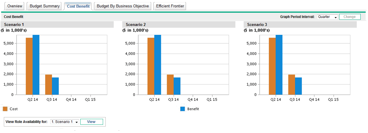
The graph for each scenario is a bar chart depicting the expected cost and expected benefit per period. This graph serves the following functions:
-
The cost and benefit bars in each graph give information regarding the net benefit by period for each scenario.
-
Since the graph is displayed by period, it also portrays the cost and benefit trends for each scenario.
For information about the cost and benefit calculations, see Overview of the Scenario Comparison Page.
To change the time interval used for the horizontal axes in the graphs on all the tabs except the Efficient Frontier tab, select a new value in the Graph Period Interval field and click Change (see Figure 5-3. Graph Period Interval field).