Add pivot table and chart
You can use Pivot table to dice the data for deeper analysis, and create reports.
Define a Dynamic Named Range
Because the data is inserted in the template when the report is created, it is impossible to create charts in the template with static range as chart source data. In order to create charts, Excel tables, and pivot tables on data inserted at report creation time, you need to create a Dynamic Named Range.
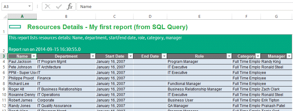
You can reuse the report created in the Create Excel reports. You can see that the first row of the data starts in cell A3 if you include the headers.

You can then create a Dynamic Named Range to include all the data from this list, even when rows are added or removed from the list.
Use the Excel functions OFFSET (to select a dynamic range) and COUNTIF (to count the number of rows with data) to create a Dynamic Named Range. If you start at cell A3 and have a table with seven columns, the formula is as follows:
=OFFSET('${TITLE}'!$A$3,0,0, COUNTA('${TITLE}'!$A$3:$A$999999), 7)
This formula states the following:
Select a range starting at Cell A3, with a width of 7 columns and a height equal to the number of cells with a value between A3 and A999999.
This means:
- You should not have any cells with data in the column A after this list.
- You should not have any cell without data in the list for column A. In this example, column A is the resource full name, so it is not supposed to be empty; but you cannot pick the Role column for computing the dynamic range because some of the Role values are empty.
Note that the spreadsheet name with the placeholder in the formula (${TITLE}) is included; it is automatically updated when the spreadsheet is renamed during report generation.
If the number of columns is also dynamic, you can replace the column number with the COUNTIF formula:
=OFFSET('${TITLE}'!$A$3,0,0, COUNTA('${TITLE}'!$A$3:$A$999999), COUNTA('${TITLE}'!$A$3:$ZZ$3))
You can then create a Named Range DataRange with the previous formula. You can create it from the menu Formulas/Name Manager, then click New and create it with a scope of Workbook so that it can be accessed from any spreadsheet. Input DataRange for the Name, and the previous formula for the Refers to: field.
If you click the Excel Name Box from the input field in the top left corner under the ribbon where the active cell number is displayed, and input DataRange, it should select the whole list of data in your spreadsheet.
Add pivot chart and pivot table
You can improve your existing Resources Details List report to include a pie chart to show resources by category, and a pivot table to count resources by role and category, with filters for manager and department. See the example of how this report looks like in Samples\2 - Adding a Pivot Table and a Chart\1 - Target report with Charts.xlsx.
Follow the steps below to add charts and pivot tables to an existing Excel report:
- Start from the report result (in this case,
Samples/1 – Your First Report/6 - Created Report with SQL query.xlsx). - Create one or more Dynamic Named Range containing the data needed in the charts and pivot tables. For details, see Define a Dynamic Named Range.
- Create all the charts and pivot tables using the dynamic named ranges. Ensure that the option Refresh data when opening the file is selected in the pivot table options on the Data tab.
- Replace the business data with the template tags and placeholders. You can copy them from an existing excel template (in this example, from
Samples/1 – Your First Report/5 - Template with SQL query.xlsx). - Remove every template placeholder or template tag from the pivot tables cells; otherwise they will be evaluated when the report is generated and will cause error. Replace all of these with a single space. The correct data will be inserted when the report is created if you selected the option to refresh data when opening the file in Step 3.
After this is done, you can obtain a document similar to Samples\2 - Adding a Pivot Table and a Chart\2 - Template with Pivot Chart and Pivot Table.xlsx.
Copy this template to your PPM server, and then run the report. The result should look like Samples\2 - Adding a Pivot Table and a Chart\3 – Created Report with Pivot Chart and Pivot Table.xlsx.
Note: If you download the PPM Report in Internet Explorer and use the “Open” menu instead of “Save”, the report file will be opened in read-only mode directly from the PPM Server. It won’t be saved locally, and this will cause pivot datasources not to load correctly when opening the file in Excel 2013 and later. If your report has dynamic pivot tables, please use the “Save” or “Save as” menu when opening PPM Excel Reports in Internet Explorer.


