Share this page


Dashboard
LoadRunner Cloud's dashboard enables you to analyze the performance of a selected run for a load test. For short demos of the dashboard features, see Feature demos.


Dashboard overview
LoadRunner Cloud's dashboard displays information about your load test run. Open the dashboard in one of the following ways:
-
Go to the Load tests page, click a test, and open the Runs
 pane. Click a run.
 -
Open the Results page and click the Dashboard icon
 in the row of the selected test run.
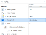
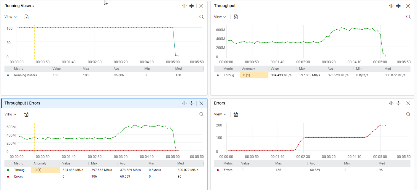
Four graphs are opened in the default dashboard view, one for each of the following metrics:
-
Running Vusers
-
Hits per second
-
Throughput
-
Errors
A dashboard view is contained in a tab. You can create up to 20 tabs for a load test run, with each tab showing a different dashboard.
For example, for run number 10 of a load test:
- Tab 1 can show metrics A, B, and C and compare the selected run to another run (number 11).
- Tab 2 can show metrics X, Y, and Z and compare the selected run to a different run (number 12).
The tabs are persistent for the current user and for the specific load test. This means that after you create a dashboard for a load test run, any tabs you create (both the initial tab and any additional ones) are applicable for all runs of the same load test.
Tab controls are located at the bottom of the dashboard. To create and work with tabs, do one of the following:
| Action | Method |
|---|---|
| Create a tab |
Use one of the following options:
The new tab that is created contains metrics for the latest run of the selected load test. If there is an active run of the load test (that is, it is currently running) then that is considered the latest run. |
| Rename a tab | Right-click a tab and select Rename. |
| Duplicate a tab | Right-click a tab and select Duplicate. The name of the new, duplicated tab is the same as the original tab name with the addition of -2. For example, if the original tab name is MyTab, the duplicated tab name is MyTab-2. |
| Close a tab |
Use one of the following options:
Note:
|
A dashboard view comprises two panes. The left pane shows which metrics you are seeing and provides various configuration options. The right pane shows the actual data in multiple graphs.
Tip: Click TRX Summary in the top of the dashboard to open a new tab with a summary of the transactions. To return to the graphs displaying the selected metrics, click its tab (by default Tab -x).

Choose metrics
The dashboard provides metrics that help you evaluate your test results. For details about the available metrics, see Dashboard metrics.
Use the following actions to configure the metrics you want to include in the dashboard.
| Action | Description |
|---|---|
| Show or hide the metrics pane | To show or hide the metrics pane, click the left or right double arrows at the top of the pane. |
|
Select or deselect a metric for viewing |
The number of selected metrics is displayed at the bottom of the Metrics pane. |
|
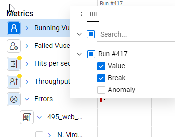
Add or remove sub-metrics by type |
To display a menu showing the number of sub-metrics by type, hover over a metric, and click the click the vertical ellipsis To customize the graph display, select Add or Remove and choose the category to display. Repeat this step for each of the categories that you want to display. To add or remove all the metrics under the parent metric, select Add or Remove and then select All. For parent level metrics, you can show the number of related scripts, transactions, locations, and emulations. For detail, see Metrics pane columns. Note: The Scripts category is only available for the following metrics: Total transactions per second, Passed transactions per second, and Failed transactions per second. |
|
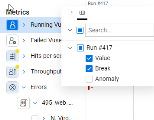
Search for a metric |
Click the magnifying glass icon to open the search box, enter a string and click the magnifying glass icon again to launch the search. The metrics whose name contains the string are displayed in the tree. |
| Open or close a metric node |
Click the expand arrow |
| Open all selected metrics |
Click Expand visible |
| Resize value columns |
Click the vertical ellipsis
|
| Highlight metrics |
Click an enabled metric in the metrics pane to highlight it in the graph. To highlight multiple metrics, press Ctrl+click or Shift+click. The graph highlights the data lines and the table entry of the metrics. |
 icon.
icon. 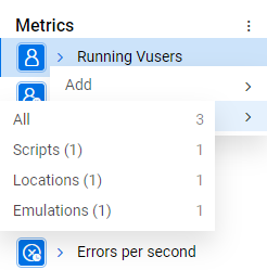
 above the metric tree to open the tree for all selected metrics.
Note:
- When you select or deselect metrics, they are only added to or removed from the currently active graph.
- Transaction response time breakdown metrics are not added to the currently active graph. Instead, each such metric is displayed in its own graph. You cannot add other metrics to these graphs.
- You can include a combined total of 1,000 metrics in all of the graphs in the dashboard.
Empty metrics
Empty metrics are grayed out and displayed in italics (both in the metrics pane and in the graph and table legends). These are metrics that were carried over from a previous run, but for which there is no data. This may be due to a change in a script or an on-premises load generator that is no longer available. Alternatively it may be a temporary state due to the fact that data has not yet been generated for the metric.
| Icon | Description |
|---|---|
|
|
Deletes a single empty metric with no data from the dashboard. |
|
|
Deletes all empty metrics. Alternatively, right-click a metric name and from the menu displayed, and select Delete empty metrics. |
Metrics that breach a configured SLA, or have anomalies, are further denoted as follows:
| Icon | Description |
|---|---|
|
|
An SLA was breached, but the breach did not cause the load test run to fail. |
|
|
An SLA was breached and the breach caused the load test run to fail. This icon also represents the detection of an anomaly together with an SLA breach (or a parent metric with an SLA breach and an anomaly for its children). |
|
|
An anomaly was detected. |
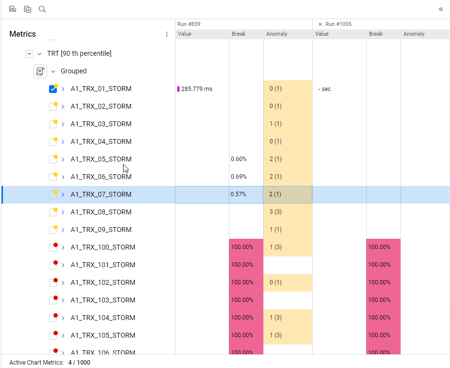
The percentage of SLA breaks for the metric is displayed in the Break column and the anomaly rank and number of anomalies is displayed in the Anomaly column.
Choose test runs
You can configure the dashboard to show a specific test run or to compare two test runs.
Show a specific a test run
To change the test run displayed in the dashboard, navigate back to the Runs pane for the test ![]() and select a different run.
and select a different run.
You can compare the selected run to another run of the same load test. The relevant metrics for the additional run are added to all the graphs in the dashboard.
To add a run for comparison, click  and in the dialog box that opens do one of the following:
| Action | Description |
|---|---|
| Add a run |
Add a non bench-marked run for comparison.
|
| Add a benchmark run |
For details on setting a run as a bench-mark, see View test details. Note: If you change the benchmark to a different run of the load test, any dashboard that already contains a comparison to the benchmark is updated to reflect the new benchmark run. If you do not want this to happen, click Compare with run id instead of Compare to benchmark. This adds the currently bench-marked run for comparison, but it will not be updated in the event of a benchmark change. |
| Clear a run |
|
When a run has been added for comparison, the run number or  is displayed next to the Compare button. Click the run number or the Benchmark button to activate or deactivate the comparison.
Click the editing icon next to the run number or the Benchmark button to re-open the dialog box to change your selection.
A Value, Break, and Anomaly column for the added run are displayed in the metrics pane, in which the values for the selected metrics, for a selected time point in the graph, are displayed.
Metrics pane columns
The metrics pane displays a hierarchical tree of the metrics available for the selected load test run. You can also display additional columns in the metrics pane: Value, Break, and Anomaly
| Column | Description |
|---|---|
| Value | The value of the metrics you select to view, for a specific time selected in the graph. When you move the time picker in the graph, the value changes accordingly. |
| Break | The percentage of SLA breaks for the metric. |
| Anomaly |
The sum of the metric’s anomaly ranks and in parenthesis, the number of anomalies. LoadRunner Cloud assigns a ranking to each anomaly based on the earliest occurrence, size, and duration of the deviation. The rank represents how the anomaly compares to other anomalies seen for the metric in the same run. The more severe or unusual the anomaly, the higher the rank. The rank range is between 0-5. For details, see Anomalies. Example: |
To choose which columns to display:
-
Click the vertical ellipsis
 in the header row, adjacent to the run number.
 -
Click the column selection icon
 .
. 
-
Select the columns to display. The metrics pane shows the selected columns.
-
To autosize the columns, click the vertical ellipsis
in the header row of the column you want to adjust, and select Autosize This Column or Autosize All Columns.

Graph display
The currently active graph is denoted by a blue border. Click a graph to make it the currently active one. When you select or deselect metrics, they are only added to, or removed from, the currently active graph.
Note: Transaction response time breakdown metrics are not added to the currently active graph, but are added as a separate graph.
The following table describes the graph's elements:
| Element | Description |
|---|---|
| Graph title |
By default, the graph's title is comprised of the names of the graph's selected metrics. You can change the graph's title by clicking the editing icon next to it. Note: If you change the graph's title, the names of newly added or deleted metrics are not added to, or removed from, the new title. |
| Legend | The graphs are line graphs, with a line for each selected metric in the graph. The lines are color coded defined by the legend at the bottom of the graph. |
| SLA breaches |
SLA breaches are shown as a red shaded area and the SLA threshold is denoted by a horizontal, dashed line. For details, see SLA breaches. |
| Anomalies | Anomalies are shown as an orange line. When you click an anomaly, the graph displays an orange shaded area. The intensity of the orange color is determined by the rank of the anomaly—the higher the rank, the stronger the color. For details, see Anomalies. |
|
X-axis, Y-axis |
The x-axis of the graph shows the load test run's time line and the y-axis shows the metric's value. If you have selected multiple runs in the dashboard, by default the time line is:
For details, see Customize the time frame. |
|
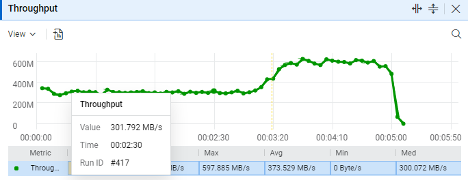
Data point tooltips |
To display a tooltip with the metric name, value, and run ID, hover over a data point inside the graph.
|
Customize graph views
You can configure the view for all graphs or you can customize graphs individually.
Customize all graph views
To customize the view for all graphs, open the View menu at the top of the Dashboard and use the following actions:
| Action | Description |
|---|---|
| Enable or disable tooltips | Toggle the Point details switch to enable or disable tooltips. |
| Show or hide SLA background color | Toggle the SLA switch to show or hide the background color for SLAs in the graphs. |
| Show or hide anomalies background color | Toggle the Anomalies switch to show or hide the background color for anomalies in the graphs. |
| Set the time display mode |
By default, the time mode used for all the graphs included in a dashboard tab is the test time. That is, the starting time of zero is the beginning of the test and the time frame is the elapsed time from the start of the test. You can change the time mode to clock time so that the actual, local clock time is displayed instead. To change between Test time and Clock time, select the required time display option. Note:
|
| Select the graph scale |
To change the scale of the graphs, select one of the following options:
Note: Graphs for transaction response time breakdown metrics are not scaled. |
|
Stop a test run |
Note: This option is available for active runs only. Click Stop Test to stop an active test run. |
To highlight a line in the graph, click it. To highlight multiple lines, use Ctrl+click. The metrics for highlighted lines are also highlighted in the metrics pane.
To customize the view for the selected graph, open the View menu at the top of the graph and use the following actions:
| Action | Description |
|---|---|
| Show or hide the graph |
You can hide or show the graph by toggling the Graph switch. |
| Show or hide the legend |
You can hide or show the graph legend by toggling the Legend switch. When the legend is displayed, you can click a column name to sort the legend table by that column. |
| Select columns |
In the Columns list, select the columns to show in the table. |
Additional customization options available are:
| Action | Description |
|---|---|
| Add to report |
You can create a snapshot for a dashboard graph and include it in the load test run's report. To create a snapshot and add it to the report, click the Add to report |
| Search |
Click the Search |
 icon in the toolbar of the graph you want to add. The snapshot is automatically added as a new section in the report. You can add a maximum of 10 snapshots to a report. For details, see
 Manage and reposition graphs
Use the following actions to add, remove, and reposition graphs:
| Action | Description |
|---|---|
|
Split horizontal |
Click To populate the new, empty graph, click it to make it active and then select the metrics you want to appear in it. |
| Split vertical |
Click To populate the new, empty graph, click it to make it active and then select the metrics you want to appear in it. |
| Close a graph | Click  to close an open graph to close an open graph |
| Reposition a graph | Click and drag a graph to reposition it in the dashboard view. |
 to split the current graph into two. The left hand graph contains the original graph and the right hand graph is a new, empty graph.
 to split the current graph into two. The top graph contains the original graph and the bottom graph is a new, empty graph.
Display transaction summary data
You can display transaction summary data in table form using the following options. The table is displayed in its own pane, either in the current tab or in a new tab.
| Display | Action | Outcome |
|---|---|---|
| Selected transactions for a run in an existing tab | In the metrics pane, select the transactions you want to display. | A new pane opens in the existing tab that includes a table showing summary data for the selected transactions. |
| All transactions for a run in an existing tab | In the metrics pane, navigate to the Transactions > Summary node. Right-click Summary and then select Show > Transactions. | A new pane opens in the existing tab that includes a table showing summary data for all the transactions included in the run. |
| All transactions for a run in a new tab |
Click the TRX Summary button. |
A new tab opens with the Transaction Summary table. It contains data from all transactions included in the run. Note: Comparisons to other run and time picker settings are not applicable to this table. |
-
Transaction name: The transaction name.
-
Script name: The script in which the transaction is included.
-
Max: The maximum time it took for a transaction to complete.
-
Avg: The average time it took for a transaction to complete.
-
Min: The minimum time it took for a transaction to complete.
-
Passed: The number of transactions that ended successfully without errors.
-
Failed: The number of transactions that failed to run until the end.
- Success rate %: The percentage of successful transactions out of all executed transactions.
-
TPS (avg): The average number of transactions per second from the beginning of the test.
-
STD: The standard deviation for transaction response time.
Note: The calculation of the transactions per second in the Transaction Summary table, TPS (avg), differs from the TPS rate shown in the widgets (graphs). The Transaction Summary table shows the average transactions per second since the start of the test run, while the widget shows the transactions per second over time, with each data point representing the average at a given time.
Customize the time frame
Use the following actions to customize the time frame for a graph:
| Action | Description |
|---|---|
| View a specific time |
Click within a graph to select a specific time in the run. The views of all the graphs are updated accordingly and the metric values displayed in the Value column in the metrics pane are also updated. The specific time selected is displayed in a time counter at the top left of the graph area. |
| Zoom to a specific frame |
The time frame for which results are displayed is shown at the top of the graph. You can change the time range using one of these options:
|
| Select a preset time frame |
Note: This option is available for active runs only. From the drop-down list to the right of the time slider, select a preset time frame to view. The time frame is the last selected number of minutes of the run. Available options are 5, 15, 30, and 60 minutes. The default time frame is five minutes. The graph is refreshed automatically every five seconds. If you use the time slider to select a time frame, Manual appears in the preset box and the graph is no longer automatically refreshed. |
 See also: