Value Stream Management widgets
Add widgets from the Value Stream Management (VSM) category to track and optimize your value delivery process.
Work item flow time trend
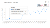
The Work item flow time trend widget helps you understand the trend of your workflow efficiency, based on the features' average flow time in scope. For details on calculating flow time, see Cycle and flow times.
The widget provides the average time it takes to deliver a feature, from the moment the work on an item starts until the item is in production.
The trend reflects the average flow time across releases. The indicators in the widget show the % decrease or increase in flow time, comparing the final time period in the widget with the previous and first time periods. The indicators help you determine whether the delivery speed is progressing with releases.
By default, the widget displays the following data.
| Display | Details |
|---|---|
| X-axis |
Done date, in months, for work items in scope that have reached the Done metaphase. You can configure the x-axis to display the items' flow time per release, sprint, or milestone. |
| Y-axis |
The average flow time for work items in scope that have reached the Done metaphase. Note: The y-axis field is read only and cannot be configured. |
Hover over a point in the trend line to view the following details:
- Average flow time, in days, for work items in scope
- Number of completed items whose cycle time is not zero
- Average number of story points per item
The widget provides a standard dashboard graph and insights. The insights display up to five work items, with the highest flow time, that were done in a specified period of time. It also helps you understand if the decrease in the average flow time indicates progress, or signals a reduction in quality. For details on the widget insights, see Insight cards.
Flow efficiency trend - waste over time
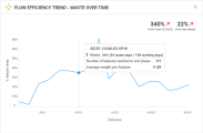
The Flow efficiency trend - waste over time widget helps you understand your workflow efficiency trend, based on waste time for features or epics in scope.
Note: The widget considers only items in the Done metaphase with cycle time more than 0. Items in the Done metaphase with 0 cycle time are not included in the widget.
The widget % indicators show the descending or growing waste trend for the first and last releases or milestones, as set in the widget scope. The indicators help you determine whether the efficiency of your development process is improving.
By default, the widget displays the following data.
| Display | Details |
|---|---|
| X-axis |
Done date, in months, for work items in scope that have reached the Done metaphase. You can configure the x-axis to display the work items' waste time per release, sprint, or milestone. |
| Y-axis |
The percentage of the aggregated waste time, out of the total cycle time for items in scope that have reached their end phase. Note: The y-axis field is read only and cannot be configured. |
Tip: On the Scope tab, define additional filters. For example, filter work items by a waste category. In this case, the widget displays only those items in the Done metaphase that are associated with the selected waste category.
Hover over a point in the waste trend line to view the following details:
- The waste percentage and the number of waste days out of all the working days in scope
-
The number of items that reached the Done metaphase
-
Average number of story points per item
The widget provides a standard dashboard graph and insights that display the top 5 work items with the highest waste time. You can drill down to identify up to 100 work items with the highest waste time in scope. For details on the widget insights, see Insight cards.
Waste time analysis
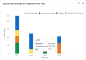
Waste time analysis is a summary widget that helps you track waste time for entities that support waste monitoring. The widget enables you to group items' waste according to categories, such as milestone, release, or team. For details on tracking waste, see Track waste.
This widget provides visibility of major waste causes in your development process. It helps you understand whether you've managed to reduce or eliminate any of the waste causes, and increase your process efficiency.
Note: For the widget Group by function, ensure that waste categories are created for your workspace. For details, see Waste management.
By default, the widget displays the following data.
| Display | Details |
|---|---|
| X-axis |
The x-axis can be configured to display the category of your choice. |
| Y-axis |
The sum of waste per category in days. The amount of waste per category is an aggregation of waste for work items that were done in the selected scope and had waste associated with this category in their lifecycle. A work item can be listed under multiple categories if it has waste associated with those categories. |
Hover over a graph section to view the total number of waste days in the given scope, as well as the amount of waste per waste category, in days and in percentage out of the total waste time.
Click a graph section for a waste category to drill down to the work items associated with that category.
 See also:


