The Service Virtualization graphs are similar to the corresponding monitors used by Controller. For details, see Service Virtualization monitors.
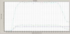
Service Virtualization Operations graph
This graph displays a summary for Service Virtualization - Operations.
| X-axis |
The elapsed time from the beginning of the scenario run. |
| Y-axis |
The number of resources used. |
| Tips |
|
| Note | To use this graph, you must first open a Service Virtualization project in Controller. |
| See also |
Example
Using the graph, you can track which resources were most problematic, and at which point(s) during the scenario the problem(s) occurred.
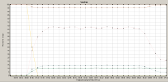
Service Virtualization Services graph
This graph displays a summary for Service Virtualization - Services.
| X-axis |
The elapsed time from the beginning of the scenario run. |
| Y-axis |
The number of resources used. |
| Tips |
|
| Note | To use this graph, you must first open a Service Virtualization project in the Controller scenario. |
| See also |
Example
Using the graph, you can track which resources were most problematic, and at which point(s) during the scenario the problem(s) occurred.


