Share this page


Dashboard widgets
ALM Octane's dashboard provides a variety of customizable widgets to assess the development progress and quality.
Add up to 30 widgets to a single dashboard view or the Overview tabs in the backlog, Quality, and Pipelines modules to suit your product and team needs.
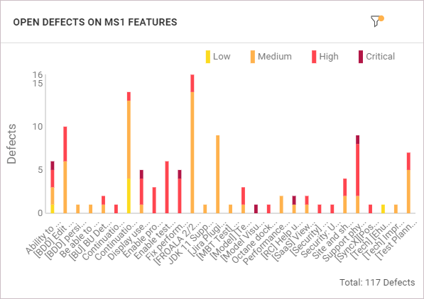
Quality analysis widgets
You can check the quality of the application development.
In the Dashboard module, add the following widgets to assess the quality:

Traceability widgets
The Traceability widget reflects relationships between a selected primary entity and a secondary entity. You can set filters both on the primary and the secondary elements.
For example, you can use traceability widgets to see the following:
-
All the requirements of a particular release, and all the tests that cover them.
-
All of your team’s features and the defects that cover them.
-
Requirements that are traced to/from a set of requirements.
To see requirements or features that do not have test coverage, use the filter to only include those without a relation.
Release forecast widget
To view your release's forecasted progress, add the Release forecast widget to the Dashboard module.
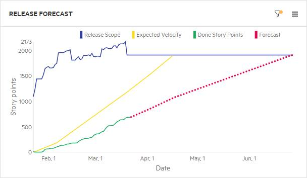
This widget displays a line with the forecasted progress of user stories or defects through the end of the selected release. This widget also includes details on the release, including finished story points and expected completion.
ALM Octane displays the forecast line after you mark enough Backlog items as Done.
Forecast calculation
-
The forecast is based on the state of the release’s actual story points until now, together with the planned story points for the team. This is based on the team manager’s expected velocity, as defined in the Team Backlog module. The gap between actual and planned velocity is used to forecast when the release content is complete, based on the assumption that this gap remains constant in the future.
For example, if the expectation to date is 50 points and actual completion is 45, the gap shows that the current pace is 90%. The forecast assumes that at the planned date of completion, 90% of the content is done.
-
If there is no expected velocity available for calculation, the forecast is based on the assumption that the actual points-per-day rate remains constant in the future.
Color representation
- The solid green line shows actual progress, and the yellow line shows expected velocity as defined by the team leader or equivalent role.
- If the forecast (dotted) line is green, this means the release content is expected to be done by the release date.
- If the line is red, the content is not complete on time, at the current rate of progress.
Where I can see forecasting
Forecasting is available in Agile widgets, but not in Custom widgets. Forecasting is available for a release, and not for a sprint. You can see forecast data in burn-up widgets only.
If there are too few story points to generate a release forecast, your widget is empty. Clear the Forecast checkbox to show data in the widget.
Features average cycle time widgets
ALM Octane provides several widgets to help you track the cycle time for your features and other work items, such as user stories and quality stories, in a specific scope.
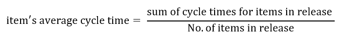
For details on calculating the average cycle time, see Cycle and flow times.
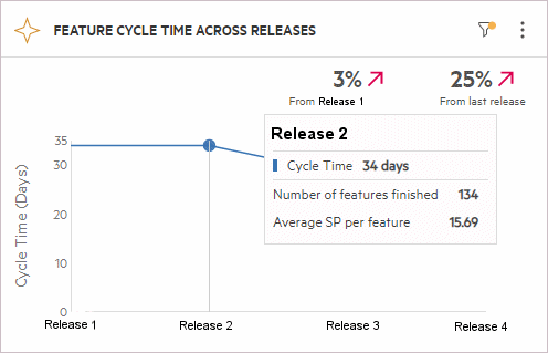
Feature cycle time across releases widget
The Feature cycle time across releases widget is a trend widget that compares the average cycle time of a feature in multiple releases.
By default, cycle time refers to the time a feature was started (In Progress) until its completion (Done). In the Scope page, you can customize the start and end phases from which to measure the cycle.
The feature average cycle time across releases is calculated as follows:
Note: Release items that have not reached their end phase or have skipped their start phase, as defined in the widget Scope, are not included in the cycle time calculation.
The widget header shows, as a percentage, the increase or reduction in the average cycle time compared with earlier releases. Using this cross-release trend widget, you can see whether you are improving your development cycle with shorter cycle time for features, resulting in less time to market.
When you hover over points in the widget, a pop up provides information about the release, for example, the number of completed features, and the average story points per feature.
Feature cycle time by phase across releases widget
The Feature cycle time by phase across releases widget is a trend widget that shows how long features remained in each phase across multiple releases.
The feature average phase time across releases is calculated as follows:
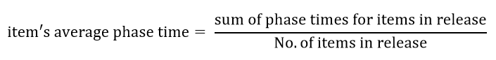
The y-axis shows the average number of days that the features remained in each phase. In the Scope page, you can indicate which phases and releases to track.
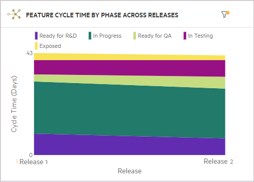
Study this widget to find patterns in the feature cycle time. This information lets you spot anomalies in the release cycle and pinpoint the problematic phases. When you hover over the different sections of the widget, the tooltips show a summary of the time periods. For example:
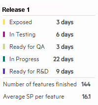
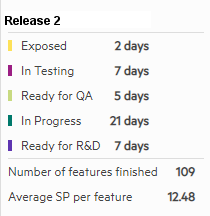
In this example, the later release shows a decrease for the In Progress phase, but an increase for the Ready for QA phase for Release 2. In the second release, the time that features waited for QA is higher, which may indicate a shortage in QA resources.
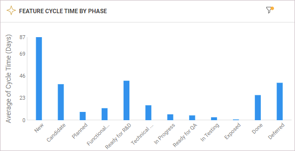
Feature cycle time by phase widget
The Feature cycle time by phase widget is a summary widget that shows how long features remained in each phase.
The feature average phase time is calculated as follows:
The y-axis shows the average number of days that the features remained in each phase. In the Scope page, you can indicate which phases and releases to track.
This widget enables you to select features completed on a specific time frame (not necessary coupled to a specific release). It also enables you to drill down to the phase time of each item in order to identify bottlenecks.
Defect resolution time widgets
ALM Octane provides several widgets to help you track defect resolution time. These widgets also have insight cards that provide you with tips and suggestions on how to interpret and act on the widget's information. An additional insight allows you to determine the quality of defect resolution, by displaying a graph of defect resolution time versus reopen rate. The Reopens field displays the number of reopens for each defect. If it is not displayed, use the Customize fields button  to add it. For details, see Insight cards.
For details on calculating defects resolution time, see Cycle and flow times.
Note: Versions of ALM Octane preceding CP5 (12.55.8) did not collect tracking data. Therefore, if the defects were handled in earlier versions, they do not appear in the widgets.
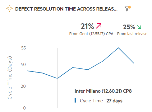
Defect resolution time across releases
This trend widget displays the defects average resolution time across multiple releases. The y-axis shows the number of days that the defects remained in phases included in the resolution cycle.
By default, the defect resolution time refers to when a defect was created (New) until its completion (Closed). Therefore, if a defect has not reached the Closed stage, it is not added to the calculation of the average resolution time. In the widget's Scope page, you can customize the start and end phases from which to measure the time.
Study this widget to find patterns in the defect resolution time. This information lets you spot anomalies in a specific release and pinpoint the problematic phases.
The widget header shows, as a percentage, the increase or decrease in the average defect resolution time, i.e. to the end phase, compared with earlier releases. This information lets you spot issues in the release cycle and pinpoint the problematic releases.
When you hover over points in the widget, a pop up provides information about the defect resolution time.
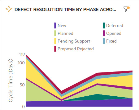
Defect resolution time by phase across releases
This trend widget shows how long defects remained in each phase across multiple releases. The y-axis shows the number of days that the defects remained in each phase. In the Scope page, you can indicate which phases and releases to track.
Study this widget to find anomalies in the defect resolution time. This information lets you spot issues in the release cycle and pinpoint the problematic phases.
In the following example, although a reduction in the resolution time occurred for Release 2, there was an increase for Release 4. specifically in the Pending Support phase. This indicates that the handling of this defect by support was a bottleneck in the development cycle.
When you hover over points in the widget, a popup shows how long the defects remained in each phase, at the selected point.
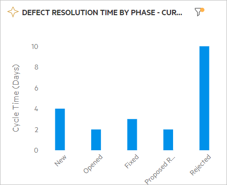
Defect resolution time by phase
This summary widget displays how long defects remained in each phase. The y-axis shows the number of days that the defects remained in each phase. In the Scope page, you can indicate which phases to track.
In the following example, it is evident that the defects remained in the Rejected phase for longer times than any other stage.
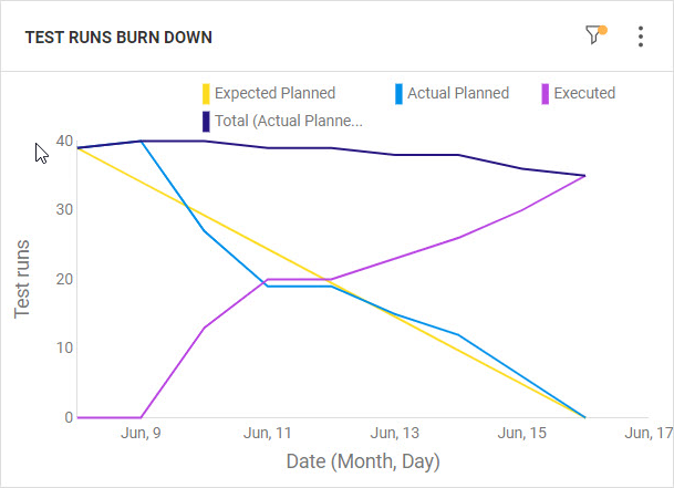
Test runs burn-down widget
The Test runs burn-down widget shows the execution of your planned runs over time, enabling you to track the convergence of your test execution plan.
The widget helps you understand if testing will be finished by the release deadline, or if you need to increase testing resources in case the burn-down is not following the expected test execution over time.
In the widget's Display tab in the configuration area, you can specify an Expected start point value. This metric is a simple baseline starting from a selected point and reaching zero at the end date. If you do not provide a value for the expected start point, the graph will use the number of planned runs at the widget's start date. For details, see Configure widget data settings.
Note: By default, the widget includes all the latest test runs that ALM Octane considers executed. This includes the runs with phases Blocked, Skipped, or In Progress. Your admin can control which test run phases can be included in the widget, by modifying the RUN_BURNDOWN_EXECUTED_NATIVE_STATUSES parameter. The phases excluded from the parameter are added to the Planned line.
For details, see Configuration parameters.
Expert users widget
The Expert users widget is available from the Overview tab of the Quality module. The widget lists users who are most active on a specific application module.
The users are rated with stars that reflect the user expertise. The level of a user's expertise is relative to other users' expertise, and is based on the following metrics:
| Metrics | Details |
|---|---|
| Item score |
ALM Octane calculates the item scores to measure user expertise for the item owners. The item score is based on the following metrics:
The item score is calculated as follows: item score = (item story points + item type constant) x degradation factor |
| Expert score |
Once the item score is calculated using the above formula, ALM Octane sums up the scores for items owned by a user. It then normalizes the scores to a scale of 0 to 100, in order to facilitate the representation. The item scores are then compared, per user:
|
Based on the expert scores, the user is rated with stars:
- 3 stars: The user has an expert score exceeding 75.
- 2 stars: The user has an expert score exceeding 60.
- 1 star: The user has an expert score exceeding 20.
Note: Users with a score of 20 or less do not get stars.
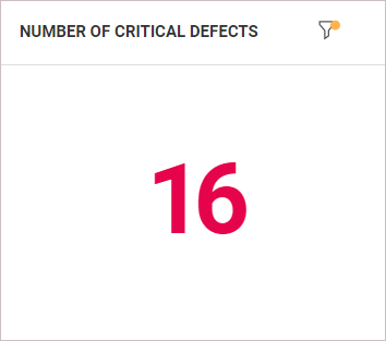
Single number (KPI) widget
You can configure a custom summary widget to display critical KPIs, such as critical defects, feature story points, or waste time, as a single number.
Configure the widget as follows:
| Fields | Values |
|---|---|
| Scope | Configure the scope to display the number for an item type in a release and milestone. Apply additional filters, as necessary. |
| Display |
Configure the following display options:
|
Tip: Click the widget number to drill down to specific items. Hover over the filter icon to view the applied filters.
 See also: