Share this page


Analyze release progress and quality
Use an assortment of tools to track a release's progress and quality.
In this topic:
- View the feature timeline
- Track progress
- Planning buckets
- Overview tab widgets
- Release forecast widget
- Defect resolution time widgets
View the feature timeline
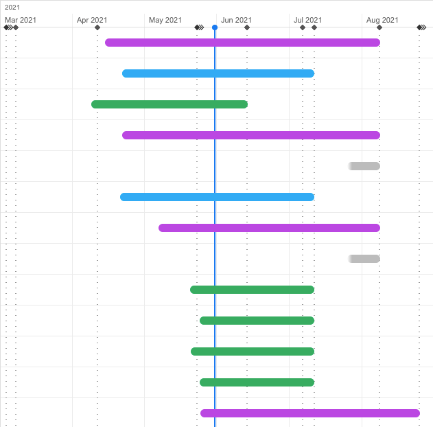
The Grid Timeline view displays your features in a Gantt chart.
The Grid Timeline view is available from the Feature tab in the following modules: Backlog, Team Backlog, and Quality. In the supported tabs, select  to display the timeline. For details, see View types.
In this section:
Feature timeline bars are constructed as follows:
-
Color. The timeline's color represents the feature's current metaphase:
Color Phase Gray New Purple In Progress Blue In Testing Green Done -
Position.The timeline's position and length are set according to the date that work started on the feature, and the feature's target milestone:
Start point The date on which the feature moved into the "In Progress" metaphase.
Fade in effect: While a feature is still in the "New" metaphase, the left end of the bar fades in.
A started feature's timeline can fade in also if the feature started before the feature timeline was introduced.
End point The date of the feature's target milestone.
Fade out effect: If the feature is not assigned to a milestone, or if the feature's target milestone has passed, the right end of the bar fades out. This is an indication that you should assign or reassign the feature to a milestone.
If a feature is in the "New" metaphase and is not assigned to a milestone, the feature is not represented by a timeline bar.
- Hover over a timeline to view details of the feature, and to drill down to the feature's details.
Milestones and the current date
Milestones and the current date are displayed as vertical lines along the timeline.
| Vertical line type | Represents |
|---|---|
| Vertical blue line | The current date |
| Dotted vertical line |
Milestone The milestone types are distinguished by the diamonds at the top of the lines:
Hover over the lines to display details of the milestones. |
Tip: By default, the timeline view only displays features directly related to the release. To show all features, click Show also indirect features at the bottom right of the pane. To revert to the original view, click Show only direct features. For details, see Relations and dependencies.
You can perform the following actions in the feature timeline area:
| Action | Method |
|---|---|
| Zoom in or out of timescale |
Timescale slider or Ctrl + mouse wheel |
| Display feature details and open the feature | Mouse over the feature timeline |
| Display milestone details | Hover over a milestone line |
If you are using a touchpad:
| Action | Method |
|---|---|
| Zoom in or out of timescale | Ctrl + two-finger scroll |
| Scroll along the timeline | Shift + two-finger scroll |
The feature timeline is not supported on the Safari browser.

Track progress
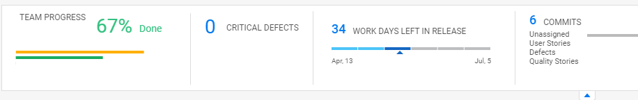
You can use the mouse over and summary widgets to view entity progress or team progress.
-
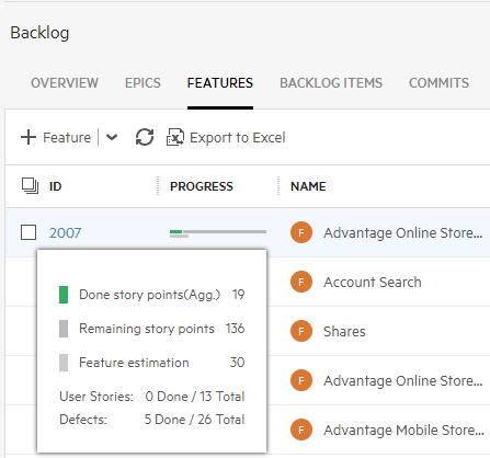
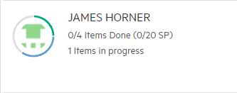
Hover over the Progress column in either the Grid or Smart List views. ALM Octane shows the progress for Epics and Features by story points, and for Backlog Items in hours.
-
Track your team's progress in the summary section of the Team Backlog module.
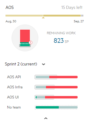
Planning buckets
-
In the Backlog module, view the release progress bucket. For details, see Use the backlog planning buckets.
-
In the Team Backlog module, view the planning buckets for each of your team members. For details, see Team planning buckets.
Overview tab widgets
The Backlog module's Overview tab provides a set of widgets that allow you to monitor progress and quality aspects of the release.
Use the default set of widgets, or select other widgets from the Widget Gallery. You can also design your own customized widgets. For more details, see ALM Octane dashboard.
The scope of the widgets in the Overview tab is set by the context filters at the top of the page, and by the epic or feature selected in the Backlog tree.
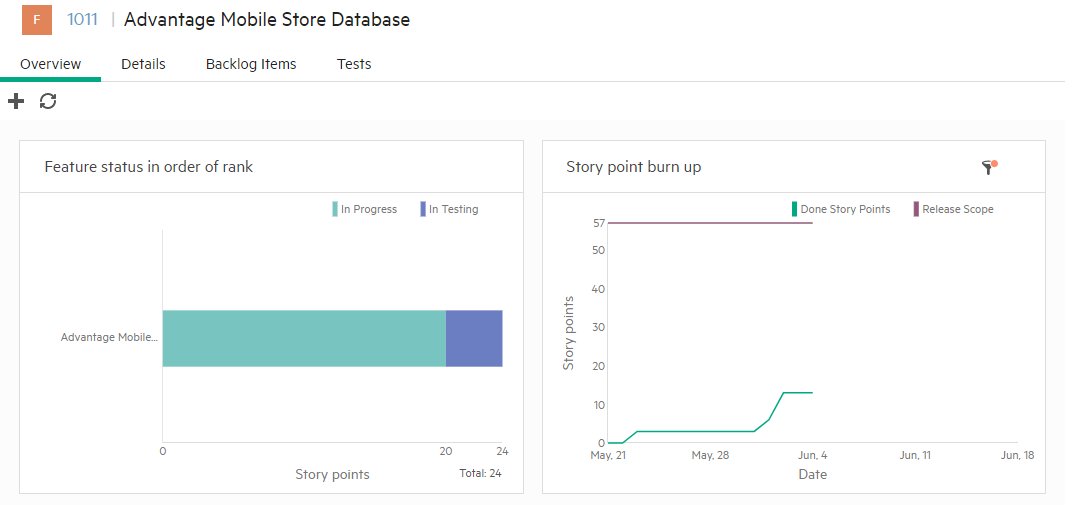
Further filter the widget data using the Filter categories in the right pane.
The Runs in Release and Runs in Milestone filters in the right pane impact only test and test run widgets.
Release forecast widget
To view your release's forecasted progress, add the Release forecast widget to the Dashboard module.

This widget displays a line with the forecasted progress of user stories or defects through the end of the selected release. This graph also includes details on the release, including finished story points and expected completion.
ALM Octane displays the forecast line after you mark enough Backlog items as Done.
How is the forecast calculated?
-
The forecast is based on the state of the release’s actual story points until now, together with the planned story points for the team. This is based on the team manager’s expected velocity, as defined in the Team Backlog module. The gap between actual and planned velocity is used to forecast when the release content will be complete, based on the assumption that this gap will remain constant in the future.
For example, if the expectation to date is 50 points and actual completion is 45, the gap shows that the current pace is 90%. The forecast assumes that at the planned date of completion, 90% of the content will be done.
-
If there is no expected velocity available for calculation, the forecast is based on the assumption that the actual points-per-day rate will remain constant in the future.
What do the colors represent?
-
The solid green line shows actual progress, and the yellow line shows expected velocity as defined by the team leader or equivalent role.
-
If the forecast (dotted) line is green, this means the release content is expected to be done by the release date.
-
If the line is red, the content will not be complete on time, at the current rate of progress.
Where can I see forecasting?
Forecasting is available on Agile graphs, and not on Custom graphs. Forecasting is available for a release, and not for a sprint. You can see forecast data on burn-up graphs only.
If there are too few story points to generate a release forecast, your graph will be empty. Clear the Forecast checkbox to show data in the graph.
Defect resolution time widgets
ALM Octane provides several graphs to help you track defect resolution time. These graphs also have insight cards, which provide you with tips and suggestions on how to interpret and act on the graph's information. An additional insight allows you to determine the quality of defect resolution, by showing a graph of defect resolution time vs. reopen rate. The Reopens field shows the number of reopens for each defect. If it is not showing, use the Customize fields button  to add it. For details, see ALM Octane insights.
Note: Versions of ALM Octane preceding CP5 (12.55.8) did not collect tracking data. Therefore, if the defects were handled in earlier versions, they will not appear in the graphs.
Defect resolution time across releases
This trend graph shows how long defects remained in each phase across multiple releases. The y-axis shows the number of days that the defects remained in each phase. In this widget's Scope page, you can configure that start and end phases that you want to track.
Study this graph to find patterns in the defect resolution time. This information lets you spot anomalies in a specific release and pinpoint the problematic phases.
The graph header shows, as a percentage, the increase or decrease in the average defect resolution time, i.e. to the end phase, compared with earlier releases. This information lets you spot issues in the release cycle and pinpoint the problematic releases.
When you hover over points in the graph, a pop up provides information about the defect resolution time.
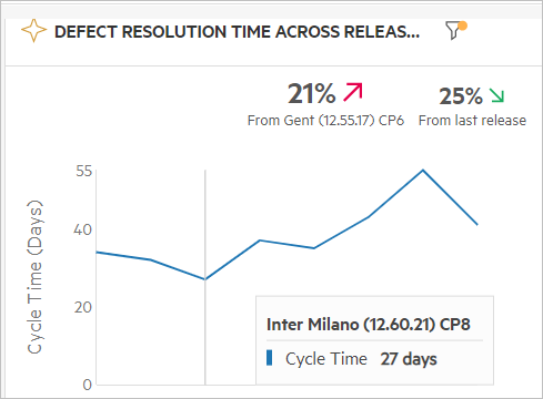
By default, the defect resolution time refers to when it was created (New) until its completion (Closed). Therefore, if a defect did not reach the Closed stage, it will not be added to the calculation of the average resolution time. In the Scope page, you can customize the start and end phases from which to measure the time.
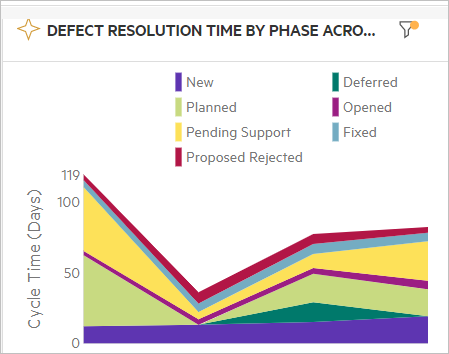
Defect resolution time by phase across releases
This trend graph shows how long defects remained in each phase across multiple releases. The y-axis shows the number of days that the defects remained in each phase. In the Scope page, you can indicate which phases and releases to track.
Study this graph to find anomalies in the defect resolution time. This information lets you spot issues in the release cycle and pinpoint the problematic phases.
In the following example, although a reduction in the resolution time occurred for Release 2, there was an increase for Release 4. specifically in the Pending Support phase. This indicates that the handling of this defect by support was a bottleneck in the development cycle.
When you hover over points in the graph, a popup shows how long the defects remained in each phase, at the selected point.
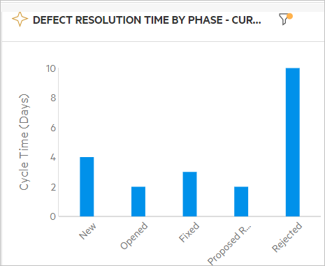
Defect resolution time by phase
This graph is not a trend graph. It is a summary graph that shows how long defects remained in each phase. The y-axis shows the number of days that the defects remained in each phase. In the Scope page, you can indicate which phases to track.
In the following example, it is evident that the defects remained in the Rejected phase for longer times than any other stage.
 Next steps: