Share this page


Configure widgets
After you add widgets in a what-if layout template, configure the settings for each widget.
Configure chart widgets
Use chart widgets to visualize your data in a way that is meaningful for your purpose. You can configure the data displayed, such as forecasted monthly costs and cost distribution by strategic themes.
The following chart widgets are available:
| Chart | Description |
|---|---|
| Trend Chart | Displays trends of data, such as budget, cost, or custom values over time. |
| Pie Chart | Displays the proportions of your data, such as cost, and custom values, in a circular visualization, with sections (slices of the pie) representing your data series. |
| Indicator Chart | Displays the grand total of budget, cost, or custom values, providing an overall snapshot. |
|
Displays bars with legends proportional to the data they present. The data can be cost, or custom values. |
Configure chart widgets
Use the options below to select chart values and configure display settings.
| Option | Description |
|---|---|
| Title | Name of the chart. |
| Axis |
Available for Trend and Stacked charts only. Select how the chart data is categorized. For example, if you select Fiscal Month, the data is categorized by month, and the X-axis displays the months. If you want to categorize the chart by a custom field, make sure the field can be grouped and is available across all the portfolios types. |
| Values |
Specify which type of value is measured by the chart.
The chart widgets support measuring the following financial values:
|
| Value Calculation Mode |
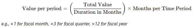
Applicable only when Sum of is selected as the value aggregation method in the Values field. For details, see Values. Specify how the summed value of the specified financial metric is distributed across scenario time periods.
The options available for the field depends on values in the Axis and Values fields:
|
| Legend |
Available for Pie and Stacked charts only. Specify what a segment of a pie or bar represents. If you want a segment to represent a custom field, make sure the field can be grouped and is available across all the portfolios types. |

Configure constraint indicators
Use constraint indicators to analyze demand vs. capacity for budget or custom values.
The following constraint indicators are available:
| Widget | Description |
|---|---|
| Budget Constraint Indicator |
Displays the total budget demand and capacity of all scenario items over the scenario time period. The demand and capacity are broken down by fiscal month, quarter, or year, depending on the template's period type setting. For details on calculating budget demand and capacity, see Budget capaicy, demand, and remaining calculations. |
| Custom Constraint Indicator |
Display capacity based on your requirements. |
Configure budget constraint indicator
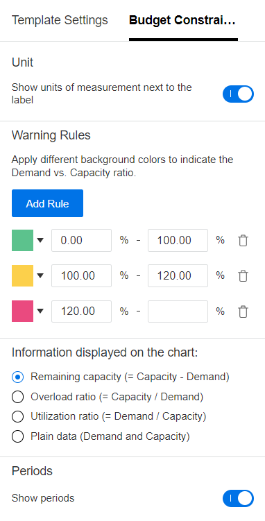
Use the following options to configure display settings for the budget constraint indicator
| Option | Details |
|---|---|
| Unit |
To display the unit of measurement in the indicator, turn on the Show units of measurement next to the label switch. |
| Warning Rules |
Assign colors to represent different Demand vs. Capacity ratios. To add a rule, click Add Rule, select a color, and specify the value range to which the color applies. |
| Information displayed on the chart |
Select the data to display on the chart:
|
| Periods | To display time periods in the chart, turn on the Show periods switch. The period type (fiscal month, quarter, or year) is determined by the Period Type setting of the template. For details, see Period Type Setting. |
Configure custom constraint indicator
Use the following options to define how capacity and demand are calculated in the custom constraint indicator.
| Option | Details |
|---|---|
| Label | Provide a name for the constraint indicator. |
| Capacity |
Select how capacity is calculated in the scenario:
|
| Demand Calculated by |
Specify how demand is calculated:
Note: If no aggregable fields are available, only the Count option is available. |
| Unit |
To display the unit of measurement in the indicator, turn on the Show units of measurement next to the label switch, and in the Unit field specify the unit used to measure demand and capacity. |
| Warning Rules | See Warning Rules. |
| Information displayed on the chart | See Information displayed on the chart. |
| Periods | See Periods. |
Configure KPI indicator
Use the KPI indicator to compare a portfolio's business goals' expected value with the target value. It helps you evaluate the feasibility of achieving the goals. For details, see Analyze portfolio business goal performance .
To show time periods in the KPI indicator, turn on the Show Periods switch. The period type is determined by the Period Type setting of the template. For details, see Configure widgets.
Configure strategic capacity indicator
Use the strategic capacity indicator to display demand vs. capacity of portfolio strategic themes.
Configure strategic capacity indicator
Use the options in the table below to configure the strategic capacity indicator.
| Configuration | Details |
|---|---|
| Demand calculation |
Configure how demand is calculated, for example, based on the total number of story points for all scenario items. The configuration is the same as that for the custom constraint indicator. For details, see Demand Calculated by. |
| Display settings |
Assign colors to present various Demand vs. Capacity ratios and configure the chart to display such information as remaining capacity or overload ratio. For details, see Configure widgets. |
Configure content view widgets
Use a content view widget in a what-if template to display scenario items in a specific view. The selected view can be used for content planning and schedule adjustments.
The following views are available.
Note: Only one content view widget can be added for each layout template.
| Widget | Description |
|---|---|
| Board View |
Displays scenario items as cards. With this view, you can reschedule scenario items to simulate budget and resource adjustments. |
| Hierarchy Gantt view |
Displays scenario items in a hierarchical Gantt chart. With this view, you can reschedule scenario items to simulate budget and resource adjustments. Limitation: The Hierarchy Gantt supports only calendar periods. If fiscal periods differ from calendar periods, the Gantt's time display will not align with the scenario's time periods. |
| Ranking View |
Displays scenario items in a prioritized order. With this view, you can prioritize scenario items and remove low-priority ones, to optimize the allocation of limited budget and resources. You can add custom fields in the ranking view to tailor it to your needs. For details, see Configure widgets. |
Configure Board view or Gantt view
Use the following options to configure Boar view or Gantt view.
| Option | Details |
|---|---|
| Show Content Type Icon on Card/Gantt |
Specify whether to show content type icons in front of content name. |
| Information Included on Card/Gantt |
Specify the data to be displayed on the cards (for Board view) or timelines (for Gantt view):
|
| Show Color on Card/Gantt |
Select the color for cards or timelines:
|
Configure ranking view
By default, all fields from the portfolio backlog are displayed as columns in ranking view. You can add custom fields or hide default ones.
-
Click Add custom field.
-
In the Add custom field dialog box, specify the label and field type.
You can add fields of the following types:
-
Text: A text column for entering text in the what-if scenario.
-
Number: A number column for entering numbers in the what-if scenario.
-
Number (formula): A number column auto-populated with a number calculated using a custom calculation formula.
-
-
For Text and Number fields, no further configuration is required. Click OK to close the dialog box.
-
For Number (formula), configure the following:
Configuration Details Format Select how calculated values are displayed:
-
Two Decimal Places: Values are displayed with two decimal places.
-
Whole Number: Values are rounded to the nearest integer.
Note: The format setting affects display only. Calculations always use the values from the database.
Formula Define a calculation formula in the Formula Editor.
-
Type a number or field name, or select a field from the list.
Fields that can be used in the formula include: Actual Benefit, Actual Cost, Approved Budget, Forecast Benefit, POR Benefit, POR Cost, Total Benefit, Total Budget, Total Cost, and user-defined aggregable fields available in all the portfolios types that can use this template.
-
Include operators to complete your formula.
Supported operators:
+(add),-(subtract),*(multiply) / (divide ), and()(parentheses) .For example, to reduce POR cost by 30%, use this: POR Cost - POR Cost*0.3.
-
-
Click OK when done.
To select displayed columns in ranking view:
- In the ranking view widget, click Choose columns.
- Select the checkboxes for the columns you want to display. To hide a column, clear the checkbox.
 See also: